The Market Phases report is inspired by the idea described in the “Momentum Turing Points” research paper written by Garg, Goulding, Harvey and Mazzoleni. Authors use a combination of shorter and longer period momentum signals to define four phases of the market – Bull Market (both long- and short-term momentum are positive), Correction (long-term momentum is positive, but short-term is negative), Bear Market (both long- and short-term momentum are negative) and Recovery (long-term momentum is negative, but short-term is positive).
We decomposed SPY ETF to define the four market phases. Afterwards, the report offers the possibility to investigate past (12-months) and future (1-, 3-, 6- and 12-months) average performances and correlation of benchmark SPY ETF and model portfolio in each of those four phases.
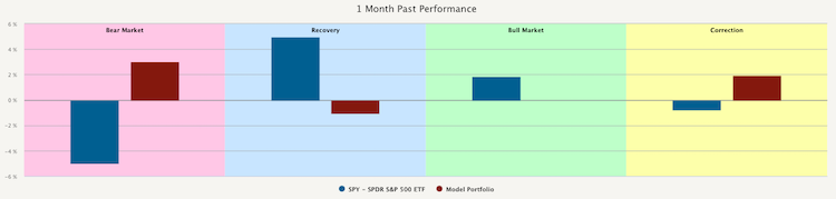
As the first model portfolio, we choose 100% Bitcoin (BTC). Some cryptocurrency proponents advocate that Bitcoin can be used as a store of value mainly during the economic and financial crisis. In the past, we have written a blog post where we argued that it is not necessarily the case. Now we use this report to confirm our stands. The following figure shows the 1 Month Past Performance of SPY (blue bars) and BTC (red bars).
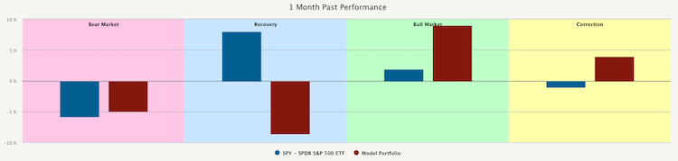
This chart shows that both 1 Month Past Performance of BTC and 1 Month Past Performance of SPY are around -5% during Bear Market. Additionally, they are both positive during Bull Market, which means BTC would not provide a good hedge. Moreover, the 1 Month Past Performance of BTC is very strong during the Bull Market.
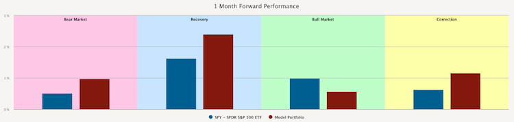
Let’s now take a look at the figure below. This figure shows the 1 Month Forward Performance of SPY (blue bars) and BTC (red bars).
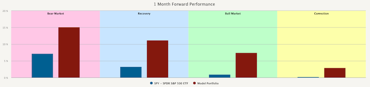
As we can see, 1 Month Forward Performance of BTC and 1 Month Forward Performance of SPY is really strong during the same parts of the cycle, specifically when SPY is in Bear Market or Recovery. However, the 1 Month Forward Performance of both declines as SPY goes to Bull Market or Correction.
In our opinion, cryptocurrencies in general, and in this case Bitcoin, are fundamentally more similar to stocks of small companies from the technological sector. It is very speculative to bet on this new asset. It may seem unrelated to the broader equity market during good times. But when stressful times come, investors are more concerned to meet a deadline for the next mortgage payment. This is the time when the speculative bets are closed and cash is raised. And this is precisely the time when Bitcoin falls as equities do too.
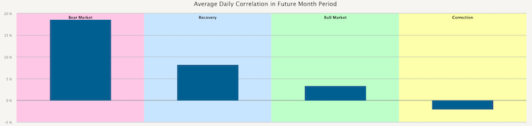
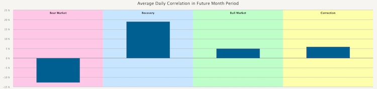
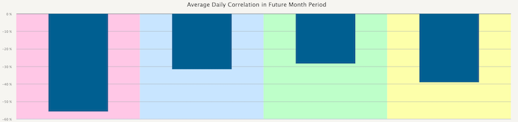
The following chart shows the Average Daily Correlation in Future Month Period of BTC and SPY. We can see that the correlation is really strong during SPY’s Bear Market, but it weakens during the times of Bull Market or Correction.
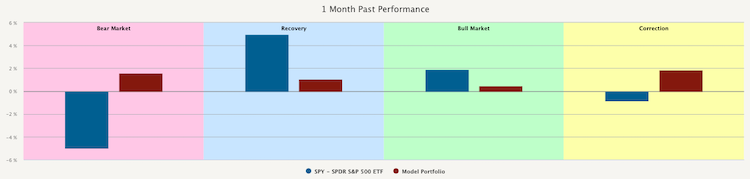
On the other hand, we can look at two types of assets we assume are a good hedge against falling stocks. The first one is gold (GLD). First, let’s take a look at the 1 Month Past Performance of our model portfolio consisting only of GLD (red bars) in comparison to SPY (blue bars). We can see that GLDs 1 Month Past Performance is positive, while SPYs performance is negative during Bear Market and Correction. Additionally, it is very weak during Recovery and Bull Market when SPYs performance is positive.
Secondly, let’s take a look at the 1 Month Forward Performance of our model portfolio (red bars) in comparison to SPY (blue bars). We can see that GLDs 1 Month Forward Performance is stronger in all market phases except the Bull Market.
Let’s now take a look at their Average Daily Correlation in Future Month Period. This chart shows that the correlation is negative while in the Bear market and very low during Bull Market and Correction. The correlation is strongest, however not higher than 20%, when in the Recovery phase. Recovery is also the phase when SPYs and GLDs individual 1 Month Forward Performances are highest.
The second type of asset that could make a good hedge against falling stocks are bonds. We specifically picked iShares 20+ Treasury Bond ETF (TLT) to demonstrate it. The chart below shows the 1 Month Past Performance of SPY (blue bars) and model portfolio, which in this case consists of 100% TLT (red bars).
This chart demonstrates that in every phase, the 1 Month Past Performance of TLT is opposite to 1 Month Past Performance of SPY, making TLT an excellent candidate for a hedge.
The next chart shows the 1 Month Forward Performance of SPY (blue bars) and TLT (red bars). As we can see, the most significant difference in performance is during the Recovery phase, in which TLTs performance is negative, while the performance of SPY is over 1.5%.
Lastly, we present the chart that shows the Average Daily Correlation in Future Month Period. From this chart, we can see that the correlation is negative in all the market phases, which means that TLT is a great potential hedge against falling stocks.
Interested? Then subscribe to Quantpedia Pro and try how our analytics and reporting significantly saves time spent on quantitative research. Or check Quantpedia Explains if you would like to see more case studies.