This case study introduces the Markowitz Portfolio Optimization tool, which calculates the efficient frontier and optimal portfolios lying on the efficient frontier based on the various constraints and during different predefined historical periods. Additionally, it shows a chart of cumulative returns and a table of return and risk characteristics of two versions of systematic allocation strategies. If you’d like to learn more about the calculations behind the tool, feel free to check out our blog post.
To illustrate the function of this report, we picked a portfolio consisting of four parts: one trading strategy – 001 – Asset Class Trend-Following and three ETFs – SPY (SPDR S&P500), DBC (Invesco DB Commodity Index Tracking Fund) and IEF (iShares 7-10Year Treasury Bond ETF). The first chart, 12-Months Period Efficient Frontier, is calculated by using past 12-Month data.
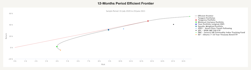
As we can see, there are three large dots on the efficient frontier and four smaller dots. The three large dots represent the Minimum Variance Portfolio, portfolio with the lowest risk, Equally-Weighted Portfolio and Tangency Portfolio, which realizes the highest possible Sharpe ratio. The four smaller dost represent the individual assets of which is the portfolio composed.
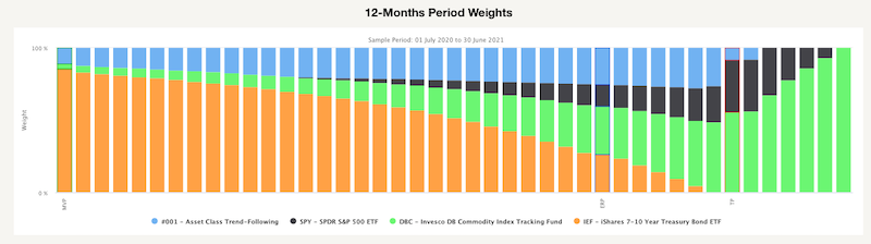
The following figure in the report shows the weights of all portfolios lying on the efficient frontier from the previous chart. As we can see, the weight of IEF is slowly getting smaller, and the weight of DBC is growing as we look from left to right (from the lowest risky Minimum Variance portfolio to the Tangency portfolio, both are also highlighted in the next figure). The Minimum Variance portfolio contains only small amounth of risky assets/strategies, while tangency portfolio (one with the highest possible Sharpe ratio) contains only risky assets and trend-following strategy.
The next two figures are very similar to the first two; the only difference between them is the length of data history. The second two charts are calculated from the longest available data history.
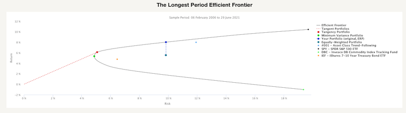
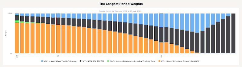
This chart also shows the three portfolios. However, there is an additional blue dot. The “new” dot represents the Efficient Risk Portfolio. This portfolio has the same level of risk as an equally-weighted portfolio but a much higher return due to the change of weights. The following figure shows the weights of all portfolios lying on the efficient frontier, including the Efficient Risk Portfolio. We can see that portfolios along the efficient frontier look different compared to the charts built out of the last 12-month period. All optimal portfolios contain a higher percentage of a trend-following strategy, and very few portfolios have exposition to commodities. It seems that it’s enough to have commodities as a part of the diversified trend-following strategy.
Secondly, let’s take a look at various Efficient Frontiers during different crisis periods. The following chart shows how Efficient Frontiers looked like during The Global Financial Crisis, Euro Crisis and Corona Crisis compared to the past 12 months. If you’d like to read more about how crises affect the financial markets, we recommend the Crisis Analysis Case Study.

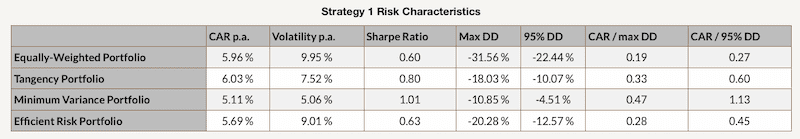
Finally, we also analyzed two strategies based on the Markowitz Model with different constraints on the weights of the assets. In the first strategy, each asset’s weight is non-negative and not greater than 1.0. Additionally, the portfolios are optimized every month based on the past 12-month period.
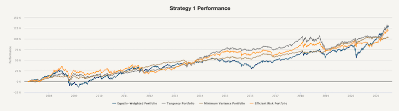
As we can see, in this case, the Tangency Portfolio and the Equally-Weighted portfolio have similar cumulative returns. However, when we look at the risk and return characteristics, we can see that the Tangency Portfolio has significantly lower volatility resulting in a much higher Sharpe ratio. Moreover, the Minimum-Variance Portfolio has the greatest Sharpe ratio and smallest Drawdown out of all four.
That’s often the case when the Markowitz Portfolio Optimization is applied out-of-sample on a periodic basis – the Tangency portfolio or Efficient Risk portfolio usually have a slightly higher (or comparable) final return than Equally-Weighted portfolio and with lower volatility. But a portfolio with the highest return-to-risk measures is the Minimum Variance Portfolio.
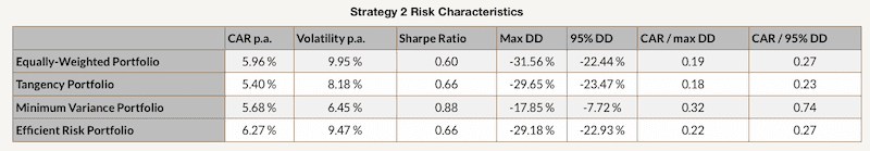
The second strategy applies different constraints on the assets – each asset’s weight is non-negative and not greater than 0.5, the portfolios are again optimized every month based on the past 12-month period. The performance of each portfolio is calculated on a daily basis with a 2-day implementation lag to reflect real-life conditions.
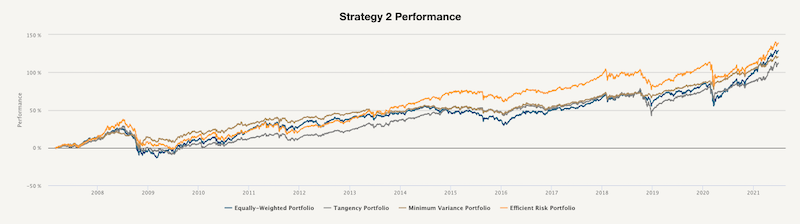
In this case, the Efficient Risk Portfolio has the highest cumulative return out-of-sample, with the Equally-Weighted portfolio and Minimum Variance portfolio being close second and third, respectively. However, when we look at the following table, we can see that the Minimum Variance portfolio has again the lowest volatility, the highest Sharpe ratio and the smallest drawdown.
Overall, the Markowitz Portfolio Optimization tool provides a handy view of the risk and returns of various portfolios created using your selected trading strategies or passive market factors as building blocks.
Interested? Then subscribe to Quantpedia Pro and try how our analytics and reporting significantly saves time spent on quantitative research. Or check Quantpedia Explains if you would like to see more case studies.