Is There Any Hidden Information in Annual Reports’ Images?
Can the number or type of images in a firm’s annual report tell us anything about the firm? Or is it just a marketing strategy that doesn’t hold any further information? With the help of novel machine learning techniques, the authors Azi Ben-Rephael, Joshua Ronen, Tavy Ronen, and Mi Zhou study this problem in their paper “Do Images Provide Relevant Information to Investors? An Exploratory Study”.
Firms seem to use more and more images in their annual reports. The authors ascribe this fact to the so-called ‘information theory’, meaning that by the extensive use of images, they make the content more engaging to the reader and easier to understand. The images help to do this in three ways: they support the narrative proposed in the text, they help to focus the reader’s attention on what the firm wants to emphasize, and lastly, they simply make the text more engaging, thus keeping the reader’s attention. The authors oppose this theory to the theory that explains visual readability as a marketing strategy or a way of boosting positive sentiment in the public, for which they don’t find sufficient evidence.
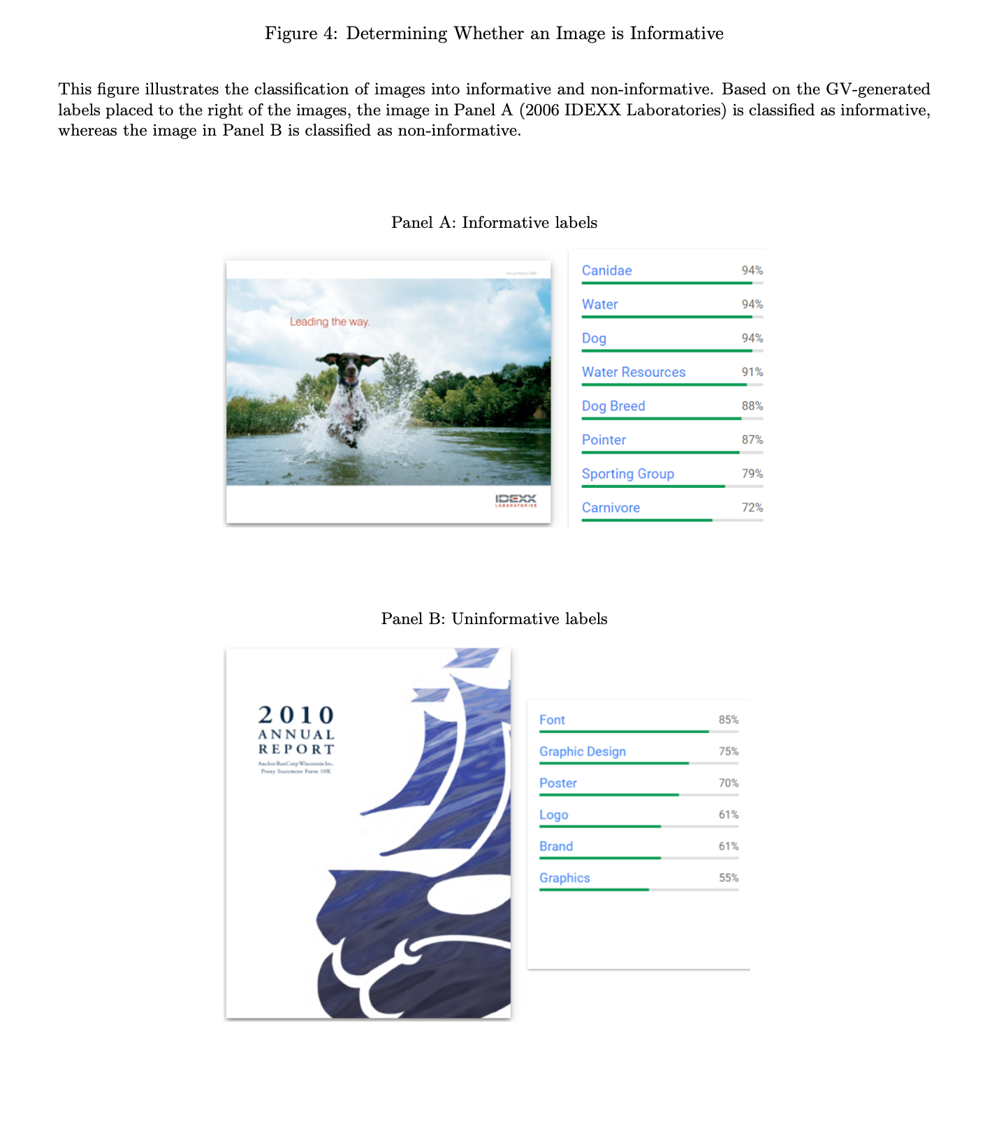
This study is innovative because even though the readability of the annual reports has been studied before, it was never the informativeness of the images themselves. Visual readability, the term authors choose for this feature of the reports, measures how much the usage of images supports the narrated story in the text. The Google Vision API machine learning that the authors use allows them to explore the informativeness of pictures on the page level. That way, they are able to assign individual images differential weights depending on the layout of the page and allow for a more complex insight. Each picture is analyzed and assigned words that describe it, as you can see in the figures below. This way, ‘non-informative images, such as logos, can be distinguished from ‘informative images’, which help to underline the meaning of the text itself. The analysis is run within-firm, so other factors don’t influence the results.
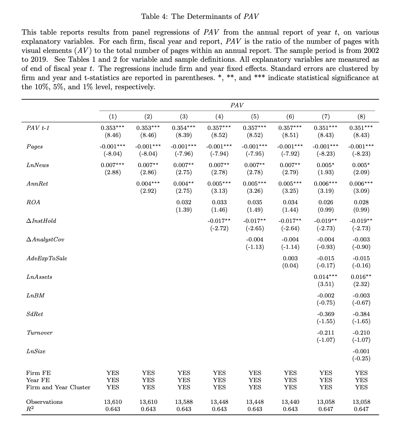
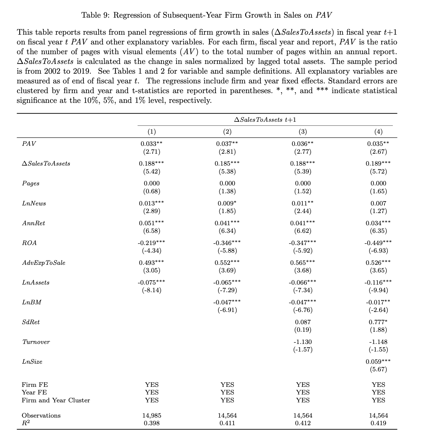
Once the pages containing the visual elements are identified, the authors construct two metrics. The first one is PAV, or ‘the percentage of all visuals’, which is defined as the ratio of pages with any visual elements to the number of all pages in the report. Over the whole sample, this is on average around 10,2%. The authors find a positive association between this metric and the number of institutional holdings of the firm in the next year. It also seems to be associated with a positive change in the bond ratings, an increase in the firm’s sales, and in ROA.
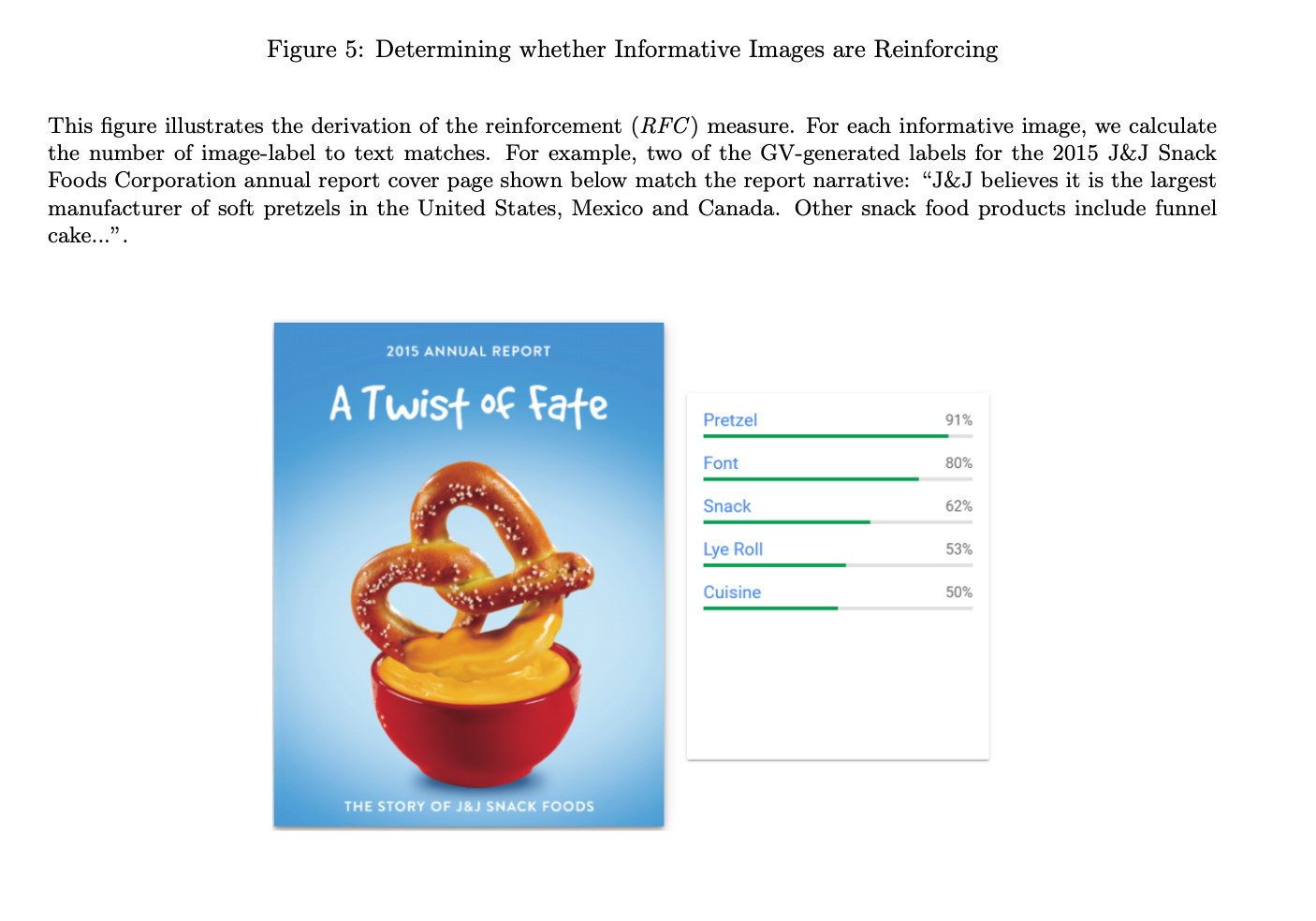
The other studied measure is titled RFC, which is the increase in information reinforcement. In other words, whether the images used are related to the words in the text of the report. This also seems to be associated with an increase in the bonds ratings, lower analyst disagreement, and better forecast accuracy.
Authors: Azi Ben-Rephael, Joshua Ronen, Tavy Ronen, and Mi Zhou
Title: Do Images Provide Relevant Information to Investors? An Exploratory Study
Link: https://ssrn.com/abstract=3954219
Abstract: We introduce the concept of “visual-readability” in annual reports and use novel machine-learning algorithms to construct visual-readability metrics: visual use and information-content-reinforcement (the degree to which information content in images reinforces text). We find that increased news coverage and asset growth are associated with increased visual use. In turn, increased visual use is associated with subsequent-year realizations: lower risk and cost-of-capital, increased institutional holdings, and higher bond ratings, market share, and ROA. Further, the degree of information-content-reinforcement is associated with subsequent lower analyst disagreement and greater forecast accuracy. By and large, our results are consistent with an information-based story.
As always we present some interesting figures:
“Access to firm information and active dissemination of information by firms reduces information processing costs (Drake, Roulstone, and Thornock, 2016; Blankespoor, 2019) and contributes to price efficiency (Blankespoor, Miller, and White, 2014; Gao and Huang, 2020; Gibbons, Iliev, and Kalodimos, 2021). An important aspect of how firms disseminate information about the underlying fundamentals is the informativeness or readability of their financial reporting, where readability affects the degree of information asymmetry, forecasting accuracy, and even investment efficiency (You and Zhang, 2009; Lehavy, Li, and Merkley, 2011; Lawrence, 2013; Biddle, Hilary, and Verdi, 2009). Other factors impacting the interpretation of firm news may include limited investor attention or limited processing capacity , especially when information is abundant or complex (Tversky and Kahneman, 1973; Hirshleifer, Lim, and Teoh, 2009, 2011).
To increase the readability and as such, the effectiveness of the financial reporting, firms have increased the use of visual information. For example, firms have increased the use of charts, maps, and infographics in their 10-K filings (Christensen, Fronk, Lee, and Nelson, 2020). But even more impressive, firms have taken advantage of the fact that their annual reports have fewer guidelines and steadily increase the use of image (non-infographic) content in their annual reports to make them as informative and attractive as possible.
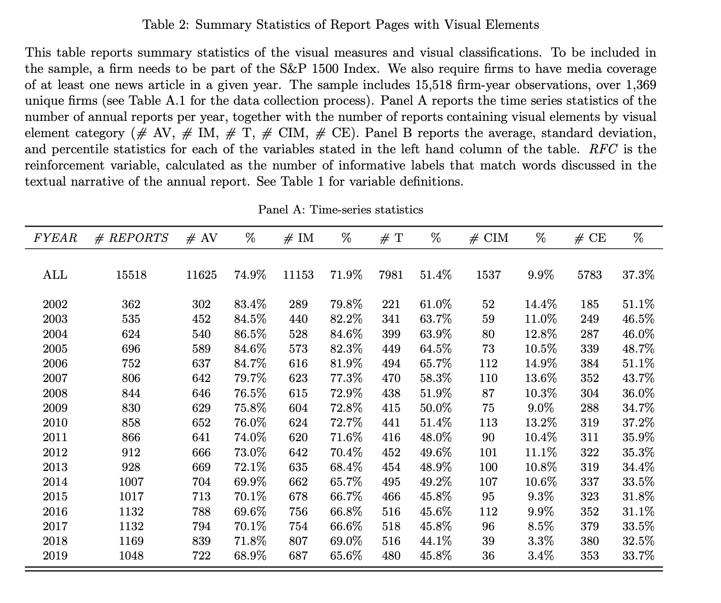
We focus on all annual reports of S&P 1500 firms from 2002 to 2019. We employ a novel approach combining machine learning algorithms and heuristic rules to identify the visual content of the annual reports at the page level.
We categorize report pages as either containing visual elements (AV) or as non-visual pages. The metric, which we denote “Percentage of All Visuals” (PAV ), captures the % use of visuals for a given report, and is calculated as the ratio of the number of annual report pages with any visual elements (AV) to the total number of the annual report pages.
Our second measure is designed to capture the content reinforcement channel. In particular, we construct a “reinforcement” metric (RFC) that measures the degree to which information content identified in images reinforces the information content in the textual narrative of the annual report. In constructing this measure, we consider only the pages classified as dominantly including images (IM). To filter out pages that are dominated by other visual elements, such as team/management photos (T), charts (CHAR), maps (MAP), infographics (INFO), or simple color embellishments (CE), we rely on machine learning algorithms and heuristic rules to identify the content of each AV page and then classify it as visual element dominance at the page level.
We conduct our analysis within-firm because firms have different styles in the way the annual reports are constructed. Some might include the 10-Ks, while others will only have a detailed summary, which could be relatively short. Moreover, a within-firm comparison can better control for unobservable cross-sectional characteristics that could be correlated with our outcome variables.
We find that more news coverage over the fiscal year is associated with higher visual use in the subsequent annual report. Firms also tend to increase their use of visual content when they experience growth in total assets over the year, suggesting that they may be trying to highlight these changes with visual aids. Interestingly, we find that a reduction in institutional holdings during the fiscal year is associated with a higher PAV, consistent with the notion that the reduced institutional investor base propels the firm to expend greater effort in conveying information.
To capture the effect on the cost of debt, we examine annual changes in bond ratings, which better capture timely changes in debt cost than accounting-based reporting. We find that the increase in visuals is associated with a positive change in bond ratings. Across bond ratings, high-yield bonds are considered to be more sensitive to firm information. Consistent with an information-based story, we find a stronger response for the subset of high-yield bonds.
Finally, the correlation between our visual metrics and standard text-based readability measures (e.g., the FOG measure used by Li (2008)) is very low, suggesting that our visual content metrics capture distinct features of readability. Nevertheless, if the use of images is associated with unobservable changes in the quality of information, our visual metrics appear to do a good job of capturing such changes. The second information-based alternative explanation is that firms tend to use more visual content when their prospects are good, suggesting that the content reflects positive private information. Thus, a reduction in risk or growth in market share are due to the firm’s future positive path, which is correlated with the visuals.
The 18,275 reports (before applying additional filters) comprise a total of 2,087,167 annual report pages. Given our focus on readability and the information environment, and since the likelihood is low that investors will focus on the annual reports of firms that have no media coverage, we require that firms have at least one news article written about them in a given year.
The number of firms with annual reports increased over the sample period and ranges from 362 in 2002 to a max of 1,169 in 2018. On average, 75% of the firms include visual elements in their annual reports. On average, 71.9% of the firms include images (IM) in their annual reports, whereas only 9.9% include charts, infographics, and maps (CIM). The average number of report pages in firms’ annual reports is 117.87. However, there is substantial variation across firms. As such, in our analysis, we focus on within-firm variation in the use of visual elements. The average value of PAV (% of any visual elements relative to the total number of report pages per firm) is 10.2%, with a standard deviation of 17.7%, and the average PIM(the % of images out of total pages) is 7%, suggesting that firms view visual content (and especially images) as an important element of their report construction. Other visual content is less frequently used, with team photos (T) constituting on average 2% of the total number of the firm’s report pages, colorful elements (CE) comprising roughly 1% of pages, and the combined use of charts, infographics, and maps (CIM ) accounting for only 0.2% of pages on average (with a 99th percentile of around 3%). Finally, the average value of RFC (the number of times information content in images reinforces textual narrative) is 13.51, with a standard deviation of 22.83.
Across all of the regression specifications, we find a negative relationship between PAV and subsequent total risk. A one standard deviation increase in PAV is associated with a reduction of 1%-2% in total risk.
Recall that the results in Table 4 indicate that the firm increases the use of visual elements when there is a drop in institutional investor holdings. Thus, we next examine whether the increase in PAV can mitigate this drop. In particular, previous studies find that institutional ownership is associated with better price efficiency, management disclosure, and firm value (e.g., Boone and White, 2015; Iliev and Lowry, 2015). An increase in the institutional investor base due to PAV can have an additional positive effect on the firm’s information environment.
Across all of the regression specifications, we find a positive relation between PAV and changes in institutional holdings during fiscal year t+1. A one standard deviation increase in PAV is associated with an annual increase of 0.30% in institutional holdings, which is not trivial.
Given the focus of analysts on the information content of annual reports, the RFC is an ideal metric to explore the relation between visual elements and analyst output.
Strikingly, the advertising expenditures of a firm reveal a positive and significant coefficient. That is, in contrast to RFC, advertising expenditures are associated with increased dispersion in analyst forecasts, suggesting the latter may increase the uncertainty faced by analysts regarding future realization whereas reinforcing images decrease such uncertainty. Overall, the results support our expectation that images are informative.
Finally, as in the case of analyst dispersion, firm advertising expenses have a positive and significant coefficient. That is, in contrast to RFC, advertising expenses are associated with lower forecast accuracy.
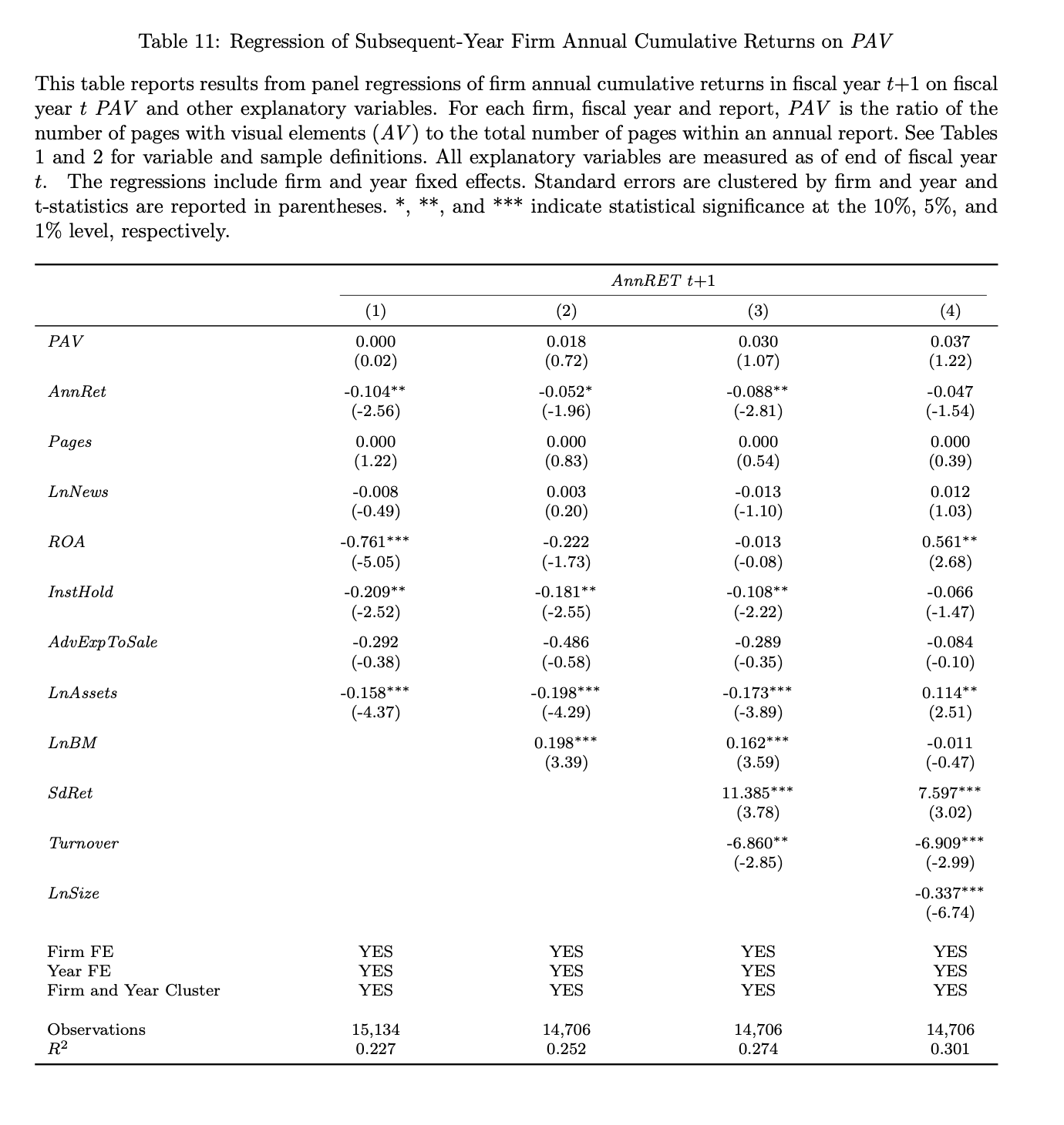
We find that visual content is predictive of lower risk, lower market betas, higher bond ratings, an increase in institutional holdings, increased growth in sales, and a higher ROA during the following year. We detect an insignificant relation between visual elements and subsequent (to the following) year returns, suggesting that the use of visuals is not associated with short-term overreaction. We find that a higher degree of reinforcement is associated with lower analyst forecast dispersion and higher forecast accuracy.”
Are you looking for more strategies to read about? Sign up for our newsletter or visit our Blog or Screener.
Do you want to learn more about Quantpedia Premium service? Check how Quantpedia works, our mission and Premium pricing offer.
Do you want to learn more about Quantpedia Pro service? Check its description, watch videos, review reporting capabilities and visit our pricing offer.
Do you want algorithmic access to the full Quantpedia database via the API? Subscribe to Quantpedia Pro, ask for an API key, and explore the in/out-of-sample statistics, source academic papers, and code snippets — ideal for quantitative research, systematic trading workflows, and AI model training.
Are you looking for historical data or backtesting platforms? Check our list of Algo Trading Discounts.
Or follow us on:
Facebook Group, Facebook Page, Telegram, Twitter, Linkedin, Medium or Youtube
Share onLinkedInTwitterFacebookRefer to a friend