The Worst One-Day Shocks and The Biggest Geopolitical Events of the Past Century
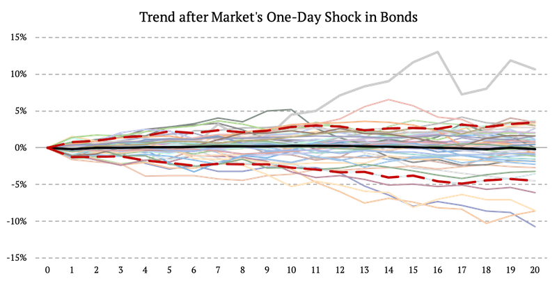
We dedicated several articles to how we created 100-year history for bonds, stocks, and commodities. Now we analyze the 50 worst one-day shocks and the following days in each of the abovementioned asset classes. In addition to that, we also look at how the Multi-Asset Trend-Following strategy performed during the same periods. Further, the second part of this article focuses on critical geopolitical events (the starts of major wars, international crises, and deterioration of US presidents’ health) and their effect on bonds, stocks, commodities, and the multi-asset trend-following strategy.
The Worst One-Day Shocks
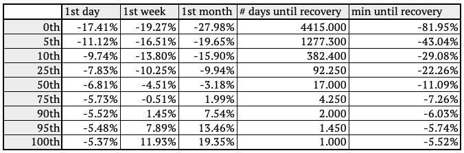
One-Day shocks in Bonds
First of all, we sorted the daily returns from the worst to the best. Then we took fifty worst one-day returns and analyzed the next couple weeks following the one-day shock.
The following figure represents the equity curves of bonds for one month after the one-day shock. The figure also shows the average return and the 10th and 90th percentile.

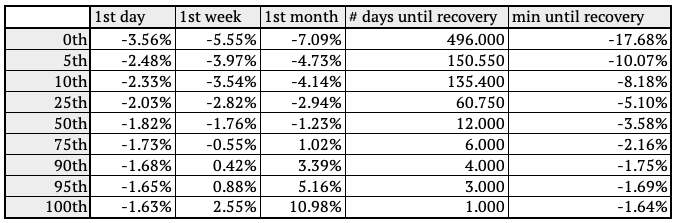
The previous table shows the distribution of performance during the one-day shock (1st-day column), bond market performance one week and one month after the shock, the average length of drawdown aftershock (#days until recovery), and maximal drawdown during the period that comes next after the shock (min until recovery column). The performance distribution is interesting as it shows that the bond market, on average, recovered after the one-day shock (50th percentile). But there are a significant number of events when the bond market continued to fall even one month after the one-day shock (percentiles 0th to 25th). So we surely can’t count on strong mean reversion after one-day shocks.
Secondly, we looked into how the Multi-Asset Trend-Following strategy performed during the same periods. And as we can see, the strategy performed much better compared to bonds. Trend strategy is diversified and not significantly influenced by negative one-day shock in bonds.

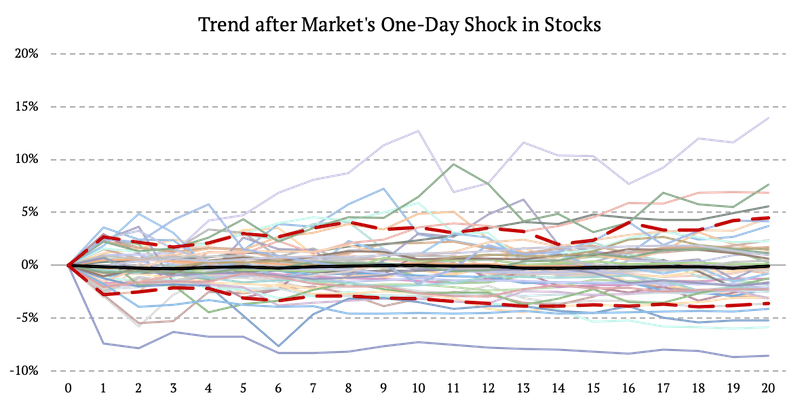
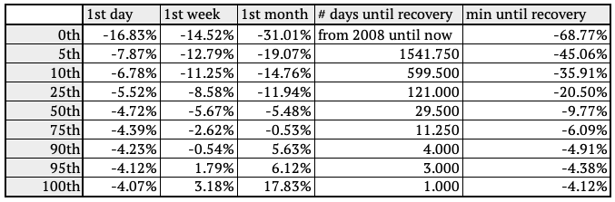
One-Day shocks in Stocks
Again, the first step was to sort 100 years of the daily returns from the worst to the best. Then we took fifty worst one-day returns and analyzed the month following the one-day shock.
The figure below represents the equity curves of stocks for one month after the one-day shock. The figure also shows the average return and the 10th and 90th percentile.
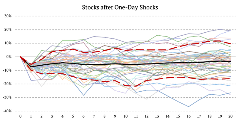
Once again the performance distribution shows that the stock market, on average, recovered after the one-day shock (50th percentile). But as in bonds, there are a significant number of events when the stock market continued to fall even one month after the one-day shock (percentiles 0th to 25th).
And we also looked into how the Multi-Asset Trend-Following strategy performed during the same periods. As before, the trend strategy is diversified and not significantly influenced by negative one-day shock in stocks.

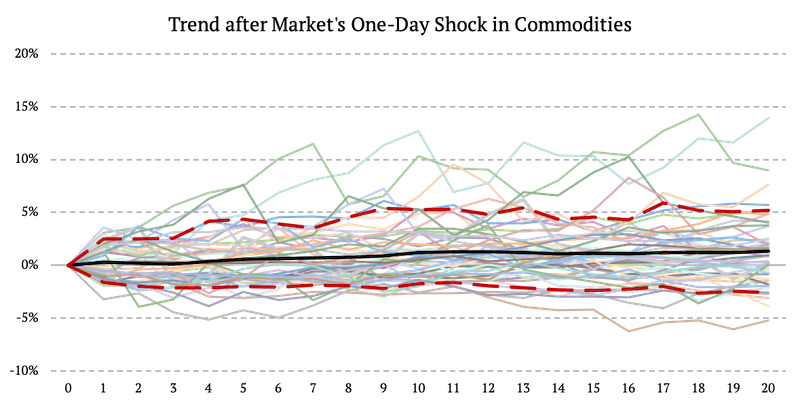
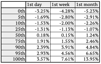
One-Day shocks in Commodities
Lastly, we sorted the daily returns of commodities from the worst to the best. We took fifty worst one-day returns and analyzed the month following the one-day shock.
The figure below represents the equity curves of commodities for one month after the one-day shock. The figure also shows the average return and the 10th and 90th percentile.
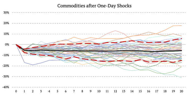
On average, commodities are the asset with the weakest mean reversion characteristics. In most of the cases (50th percentile), commodities continue to fall even one month after the one-day shock.
And we also looked into how the Multi-Asset Trend-Following strategy performed during the same periods. As the following table shows, the strategy has a positive average return during the periods which follow the biggest shocks in commodities.
Biggest Geopolitical Events of the Century
Similar to the figures we illustrated above, we also analyzed time periods following the century’s most significant events. We sorted them into three categories:
- Major Wars,
- International Crisis,
- USA President’s Health and Stock Market
We analyzed the performance of the US Market (stocks) and the multi-asset trend-following strategy during the periods mentioned above.
Major Wars
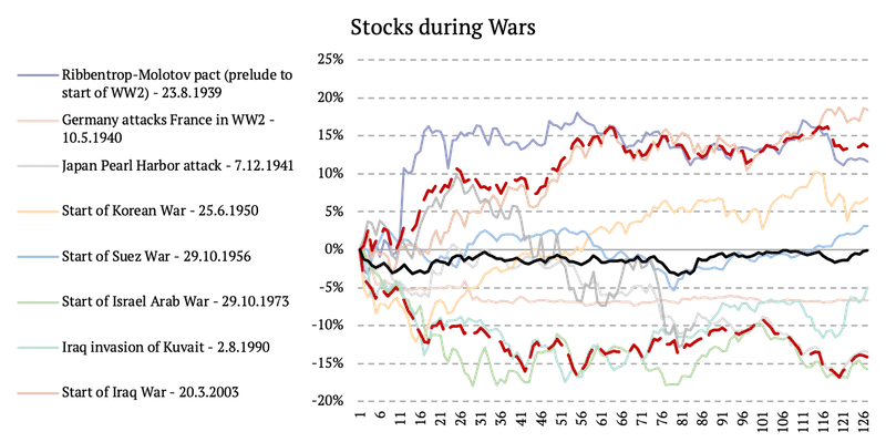
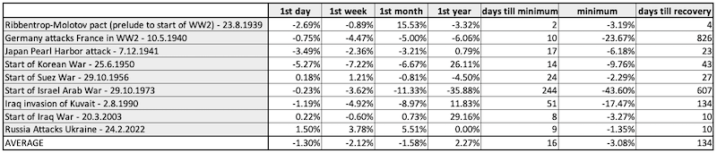
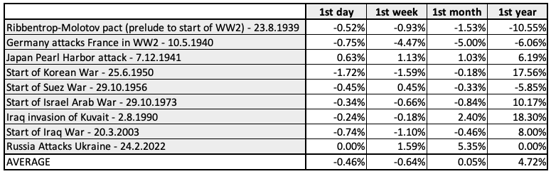
In this section, we analyze nine wars and look at the performance of the US market and the multi-asset trend-following strategy during the periods following these events. The wars we examine are:
- Ribbentrop-Molotov pact (prelude to start of WW2) – 23.8.1939
- Germany attacks France in WW2 – 10.5.1940
- Japan Pearl Harbor attack – 7.12.1941
- Start of Korean War – 25.6.1950
- Start of Suez War – 29.10.1956
- Start of Israel Arab War – 29.10.1973
- Iraq invasion of Kuwait – 2.8.1990
- Start of Iraq War – 20.3.2003
- Russia Attacks Ukraine – 24.2.2022
The following figure shows the performance of stocks during the periods following the major events as well as the average return (black line) and the 10th and 90th percentile (dashed red line).
Quick analysis shows, that the performance of stock market after the start of the war is not uniform. Some wars impact stock market more than others. On average, the maximal risk up until one month is -17%. On average (black line in the chart), the stock market is not impacted a lot.
As the figure below shows, the average performance of the multi-asset trend-following strategy was positive even during major wars.

International Crisis
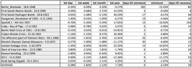
Secondly, we expanded our cold-war crisis study and looked at the triggers of fifteen international crises, including:
- Berlin Blockade – 18.6.1948
- First Soviet Atomic Bomb – 23.9.1949
- First Soviet Hydrogen Bomb – 20.8.1953
- Hungarian Revolution of 1956 – 4.11.1956
- Sputnik 1 – 4th Oct 1957
- Cuba – Bay of Pigs – 17.4.1961
- Berlin Wall Crisis of 1961 – 13.8.1961
- Cuban Missile Crisis – 22.10.1962
- Tet offensive (part of Vietnam War) – 30.1.1968
- Munich Olympic Games Massacre – 5.9.1972
- Iranian hostage crisis – 5.10.1979
- Start of Iraq-Iran War – 22.9.1980
- Kosovo bombing – 23.3.1999
- 9/11 – 11.9.2001
- Arab Spring (Egypt) – 25.1.2011
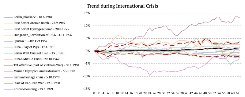
The following figure shows the performance of stocks during the periods following the major events, as well as the average return (black line) and the 10th and 90th percentile (dashed red line). We can see that the crisis period is usually short-lived, with an average maximal drawdown on the 8th day after the start of the crisis and nearly complete recovery one month after the crisis.

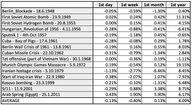
As the figure below shows, the average performance of the multi-asset trend-following strategy was again positive during international crises.
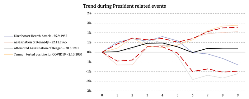
USA President’s Health and Stock Market
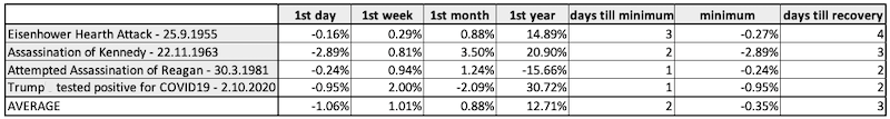
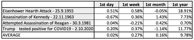
Lastly, we examined how the health of the US presidents affected the US market over the past 100 years. We analyzed the following events:
- Eisenhower Hearth Attack – 25.9.1955
- Assassination of Kennedy – 22.11.1963
- Attempted Assassination of Reagan – 30.3.1981
- Trump tested positive for COVID19 – 2.10.2020
Surprisingly, the health of the US president does not affect the market as much as one might think. The following figure shows the performance of stocks during the abovementioned periods as well as the average return and the 10th and 90th percentile. We can see that, on average, the stock market was impacted by the US president’s health problems only for two trading days.

Are you looking for more strategies to read about? Sign up for our newsletter or visit our Blog or Screener.
Do you want to learn more about Quantpedia Premium service? Check how Quantpedia works, our mission and Premium pricing offer.
Do you want to learn more about Quantpedia Pro service? Check its description, watch videos, review reporting capabilities and visit our pricing offer.
Do you want algorithmic access to the full Quantpedia database via the API? Subscribe to Quantpedia Pro, ask for an API key, and explore the in/out-of-sample statistics, source academic papers, and code snippets — ideal for quantitative research, systematic trading workflows, and AI model training.
Are you looking for historical data or backtesting platforms? Check our list of Algo Trading Discounts.
Or follow us on:
Facebook Group, Facebook Page, Twitter, Linkedin, Medium or Youtube
Share onLinkedInTwitterFacebookRefer to a friend