Navigating the financial markets requires a keen understanding of risk sentiment, and one often-overlooked dataset that provides valuable insights is FINRA’s margin debt statistics. Reported monthly, these figures track the total debit balances in customers’ securities margin accounts—a key proxy for speculative activity in the market. Since margin accounts are heavily used for leveraged trades, shifts in margin debt levels can signal changes in overall risk appetite. Our research explores how this dataset can be leveraged as a market timing tool for US stock indexes, enhancing traditional trend-following strategies that rely solely on price action. Given the current uncertainty surrounding Trump’s presidency, margin debt data could serve as a warning system, helping investors distinguish between market corrections and deeper bear markets.
Introduction
Borrowing to invest is a common strategy that can amplify both returns and risks in financial markets. One key measure of this leverage is margin debt—the total amount investors borrow to buy stocks using their holdings as collateral. An increase in margin debt often signals rising investor confidence and a willingness to take on more risk, which can drive stock prices higher. Conversely, a decline in margin debt may indicate risk aversion, deleveraging, or market uncertainty, potentially leading to lower stock prices. Given its strong connection to market sentiment and liquidity, margin debt can serve as a valuable indicator of stock market movements. Therefore, our goal is to explore how margin debt can be utilized to predict SPY price growth by developing a systematic investment strategy.
FINRA was the source for margin debt data, and data can be easily obtained starting in 1998. Therefore, we used SPY as a proxy for the stock market performance from January 30, 1998, to December 31, 2024. FINRA reports margin debt statistics monthly, so all calculations in this article are based on monthly data, and each individual tested strategy was rebalanced monthly, too.
Methodology
Similar to our previous market timing studies (like Using Inflation Data for Systematic Gold and Treasury Investment Strategies or Insights from the Geopolitical Sentiment Index made with Google Trends), we aimed firstly to understand the behavior of the new data set and visualization of the dataset helps with that:
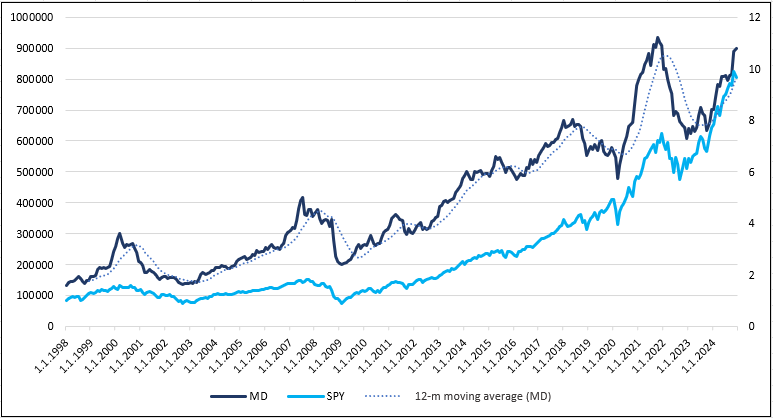
Visual analysis uncovers that the local peaks in margin debt seem to coincide in time with the local peaks in the SPY; however, from time to time, the margin debt peaks precede the SPY peaks by a few months. The stock market indexes are well known for their trending behavior, and trend-following rules work well on indexes. Therefore, our next step was to try to use similar trend-following rules also for the margin debt dataset and study whether the signals from the margin debt data outperform price-based signals alone, alternatively, whether we can combine price and margin debt signals to obtain strategies with better performance of return-to-risk rations then pure price-based trend strategies.
As we want to compare the margin debt signals (and the combination of price + margin debt signals) to price-based strategies, we first must study those price-based trend strategies to create a benchmark that we will then try to beat.
SPY moving average strategies
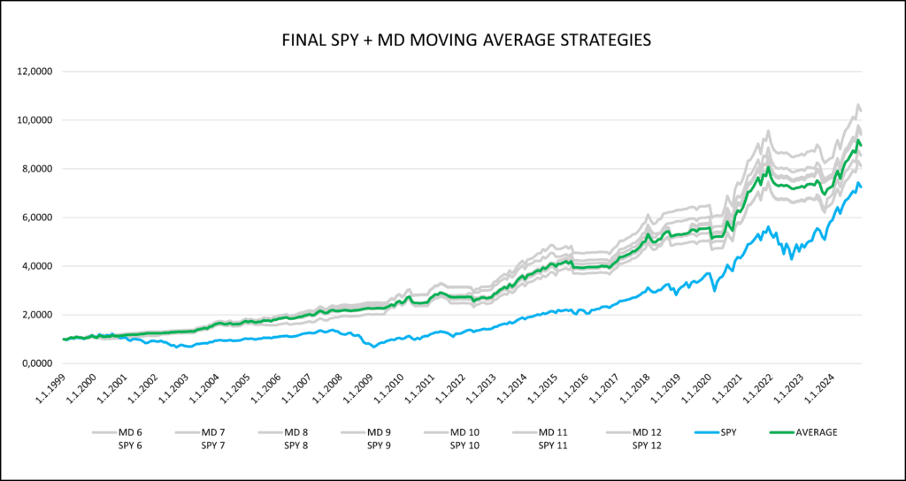
Our default “go to” price-based predictor for SPY is usually a simple moving average. We began with a 3-month moving average and gradually increased the window to 4, then 5 months, continuing this process until we reached a 12-month moving average of SPY total return (dividend & split-adjusted) price series (normalized to start at 1$ on January 30, 1998). At the end of each month, the most recent available value was compared to the moving average. If the latest SPY value exceeded the moving average, it signaled a SPY long position for the next month. Otherwise, we assumed that instead of investing in a risky asset (SPY ETF), capital would be held in a low-risk asset represented by SHY ETF (iShares 1-3 Year Treasury Bond ETF, a common proxy for the low-risk, cash-like investment). This procedure was applied to each moving average period. To determine how each trend strategy with each moving average period of SPY fared, we also visually compared individual strategies, following the approach used in How to Improve Commodity Momentum Using Intra-Market Correlation. For better insight, every month, the average of all moving averages was calculated to obtain the equally weighted average strategy across each moving average. This “average trend-following strategy” is our proxy for the benchmark, and we would like to beat it with the usage of the margin debt data.
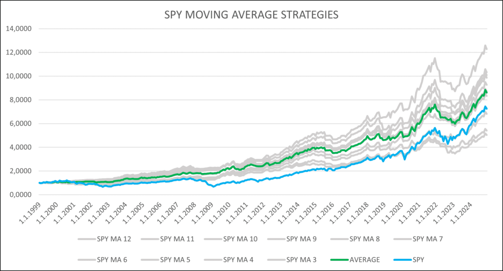

Both numerical calculations and visual illustrations indicate that SPY’s moving averages are effective predictors for SPY itself. The strategies using trends with medium length (6-12 months) all beat SPY on the performance basis and return-to-risk basis. Even though the performance of strategies using the 3-, 4-, and 5-month moving averages are lower than SPY’s, their standard deviation or maximum drawdown is significantly lower than SPY’s and, therefore, have higher Sharpe and Calmar ratios. The average of all of the trend strategies also outperforms SPY in all aspects (performance and return-to-risk measures, too).
However, this is not a new fact. What interests us, however, is how strategies based on margin debt data will perform in comparison… Will they be able to achieve better results?
Margin debt moving average strategies
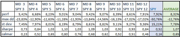
To determine whether the moving average of margin debt is a better predictor for SPY than its own moving average of price, we repeated the same procedure and created strategies based on 10 different moving averages of margin debt (3-month, 4-month, …, 12-month moving averages). We also built an equally weighted strategy combining these moving averages and compared their performance to SPY’s performance.
The testing principle remains the same: when the latest available margin debt value was higher than its moving average, we bought SPY. Otherwise, the capital was held in cash. However, margin debt data is typically released with a one-month lag, meaning the buy signal is based on month-old values, unlike SPY’s moving averages, which use real-time prices. So, for example, for a moving average calculation of the SPY at the end of May, we can use the price data from the end of May (as they are known on a tick-by-tick, second-to-second, minute-to-minute basis). On the other hand, when we calculate the moving average signal from the margin debt data, we use April as the last data point for the calculation at the end of May, as FINRA usually distributes April’s data in the second half of May and more up to date data are not available at that time.
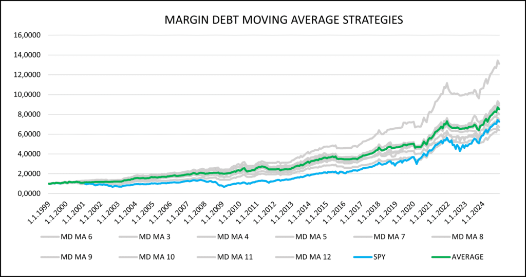

At first glance, there are no clear visual differences between the equity curves in Figure 2 and Figure 3. Therefore, numerical characteristics are more informative. On average, return-to-risk measures from Table 2 (strategies using margin debt data) exceed return-to-risk ratio measures of strategies based on price moving averages alone. Therefore, we can conclude that, during our sample, the margin debt strategies have indeed profitably predicted SPY’s behavior. However, the price action of SPY itself is also a favorable predictor. Therefore, in the next part, we will combine these two predictors into one strategy.
A combined price trend + margin debt trend strategy
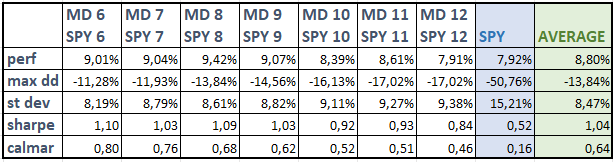
In this step, we decided to combine the two previous strategies and asses whether the combined strategy has better market timing characteristics and outperforms individual components alone. Each moving average period of SPY was assigned the corresponding moving average of margin debt for the same period. If the last available data point of both data series were higher than their respective moving averages at the same time, we received a signal to invest in SPY. Otherwise, the capital was held in the risk-free asset (SHY ETF).
With this approach, we created 10 new indicators, the 3-month moving average of SPY combined with the 3-month moving average of margin debt, …, up to the 12-month moving averages of both. Equally weighted (average) strategy of moving average pairs was also built. Once again, margin debt prices were lagged by one month, while SPY prices were up to date at any given time.
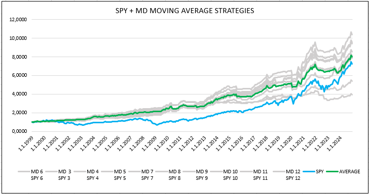
Now, we can compare the results in Table 3 (combined strategy) with individual predictors in Tables 1 & 2. On average, the return-to-risk measures of the combined strategies are higher than those of individual components, and this holds true mainly for the medium-term, 6-12-month horizons.
Final model
If we review the equity curves of the combined strategies, we can see that during the last three years of the testing period, SPY achieved higher returns than some combined strategies. In Table 1 and Table 2, we can see that moving averages for shorter periods, specifically 3-, 4-, and 5-month periods, achieved lower returns than the longer ones (6-12 months). This can be just a temporary setback, or it can suggest that longer time-frames (6-12 months) are better suited as predictors for the underlying datasets. The 6- to 12-month period is also the most used period for trend-following predictors in the academic literature. For this reason, we decided to exclude 3- to 5-month period from our final model.
The average strategy is now designed so that every month capital is equally distributed across seven strategies using the combined moving averages (the 6-month moving average of SPY combined with the 6-month moving average of margin debt, …, up to the 12-month moving averages of both).
The idea of not building the final strategy on just one best parameter (for example, 8-month moving average), but averaging over more parameters is also supported by our findings from our older article – How to Choose the Best Period for Indicators. Our analysis suggests that instead of relying on a single indicator, a set of multiple indicators with different periods should be used, as this approach reduces the risk of underperformance in future periods. If one indicator does not perform well in the out-of-sample period, the others can compensate for its weak performance.
Before we conclude, we may ask one more question – Why not combine the best moving average period of margin debt with the best period of the SPY’s moving average? As shown in Figure 3, the 6-month moving average of margin debt achieved significantly higher returns (and return-to-risk ratios) than other parameters. However, we believe that this occurrence is just a stroke of luck and will not be sustained in the future, and sooner or later, mean reversion will occur. Therefore, once again, we prefer to spread out bets in the portfolio among all of the other parameters to have a more stable model.
Conclusion
Our expectations were met— the margin debt dataset can indeed be used to predict SPY’s price growth. While the moving average of SPY alone serves as a strong indicator, combining it with the moving average of margin debt further enhances its predictive power. This effect is most pronounced for moving averages with lengths between 6 and 12 months. The optimal approach for mitigating the impact of possible future mean reversion in returns is to distribute investments equally across multiple periods of these combined trend-following strategies and ensure that if the performance of one particular moving average period declines, the others can help sustain overall profitability.
Author: Sona Beluska, Quant Analyst, Quantpedia
Are you looking for more strategies to read about? Sign up for our newsletter or visit our Blog or Screener.
Do you want to learn more about Quantpedia Premium service? Check how Quantpedia works, our mission and Premium pricing offer.
Do you want to learn more about Quantpedia Pro service? Check its description, watch videos, review reporting capabilities and visit our pricing offer.
Are you looking for historical data or backtesting platforms? Check our list of Algo Trading Discounts.
Or follow us on:
Facebook Group, Facebook Page, Twitter, Bluesky, Linkedin, Medium or Youtube
Share onLinkedInTwitterFacebookRefer to a friend