Automated Trading Edge Analysis
Have you ever wondered if your trading asset trends or mean-reverts? Everyone involved in trading or investments daily solves the task of – What trading strategy should I apply to my assets to generate profits? As always, we at Quantpedia will try to help you a bit with this never-ending task with our new tool/report, which will be unveiled next week for all Quantpedia Pro subscribers. The following article serves as an introduction to the methodology we will use to find new trading edges for you automatically.
How to find out what trading strategy to use?
In this article, we analyzed various statistical, empirical, and other trading properties of underlying assets. In other words, we tried to find which trading edges work and which don’t seem to when applied to our chosen asset and then derived potential trading strategies out of the promising ones.
Statistical properties of an asset
We started with statistical properties. Firstly, we analyzed trend-following/mean-reversion by applying the Durbin-Watson test and the Ljung Box test to our underlying asset – US equities represented by SPY ETF.
The Durbin-Watson test examines autocorrelation between returns of two consecutive days (weeks/months/ etc.). The value of the Durbin-Watson test statistic always falls between 0 and 4. A value of 2 indicates no autocorrelation. There is a negative autocorrelation if the statistic is greater than 2. On the other hand, if the statistic is less than 2, the autocorrelation is positive.
The Ljung Box test is another way to test for autocorrelation. The Ljung Box test tests for the absence of serial autocorrelation up to a specified length of lag.
However, these tests have one significant disadvantage; it is hard to link their results directly to actual economic results, i.e. profitability of the trading strategy (try it, we did). This makes them unfit for our analysis, as we could not build a strategy based on them. Meanwhile, the Hurst Exponent seemed to produce much more practical results. What is the Hurst exponent then?
The Hurst Exponent can be used to measure long-term memory of time series. We applied Hurst Exponent to find statistically significant trend/mean-reversion periods.
Empirical asset analysis
Empirical analyses can be oftentimes much simpler and even more useful in a real, investment life. Therefore, secondly, we conduct numerous empirical trend, mean-reversion and volatility-based analyses. We then compare profitability of various empirical trading ideas by analyzing subsequent return distributions of assets based on our ideas. This can be depicted nicely e.g. via probability density functions.
Although empirical asset analysis already produces promising results, it is still not sufficient to evaluate whether our idea actually results into a profitable investment strategy or not. To find out if we produced a profitable trading strategy, we need to (surprisingly) look at the results of the trading strategy itself.
Practical trading edge analysis
That being said, in the last section, we create multiple simple trading strategies, so-called short-term trading edges. This includes various simple trading ideas based on already mentioned phenomena of trendiness, mean-reversion, volatility properties of an asset and more.
The best way to test a trading edge is to actually examine what trading results it produces, right? And we can easily do this by backtesting our investment idea using historical data. Then we can analyze risk/return characteristics of such strategy idea. And that’s exactly what we do in the last section of our article.
Statistical trading edge – Hurst Exponent
The Hurst Exponent originated in hydrology. British hydrologist H.E. Hurst first used the exponent in 1951 to model the water levels of the Nile River and to determine the optimal size of a dam. Nevertheless, due to its ability to determine a long-term memory of a time series, it also found many applications in finance and investing.
Very simply said – the bigger the Hurst exponent, the more an asset should trend. On the other hand – the smaller the Hurst coefficient, the more an asset should mean revert.
To illustrate the Hurst exponent usage, we calculated the rolling Hurst coefficient over a period of twenty years (July 2002 – January 2022) on SPY ETF (SPDR S&P 500 ETF Trust). Every 20-days, we calculate Hurst Exponent from the previous 3-years, its t-statistic, and p-value. The following figure illustrates the rolling Hurst Exponent. The red line represents the value of the expected Hurst Exponent (i.e. neutral value).
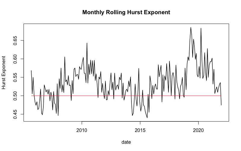
If the exponent is significantly greater than 0.5, we say that the underlying asset has a long-term memory. Higher values also indicate less volatility. To test the significance of our results, we first calculate the t-statistics.
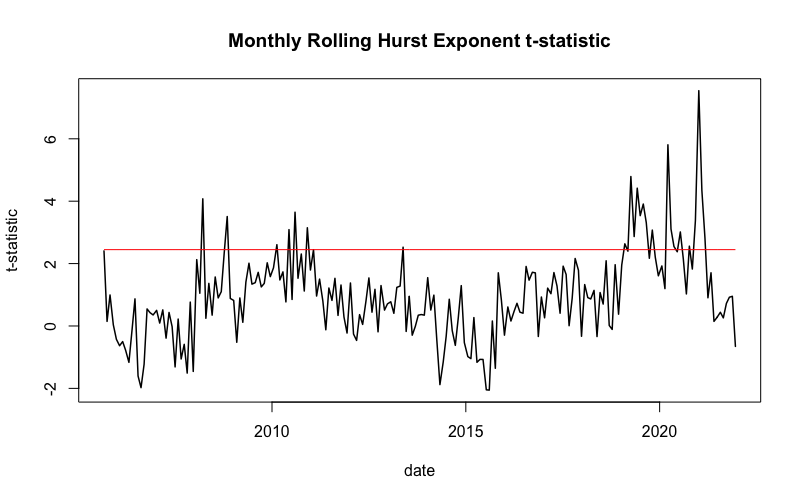
Hurst Exponent is statistically significant (red line in the chart), when the t-stat is greater than the 97.5% quantile (~ 2.447) or smaller than the 2.5% quantile (~ -2.447) of Student’s t-distribution.
Secondly, we also calculated the p-value of the rolling Hurst exponent.
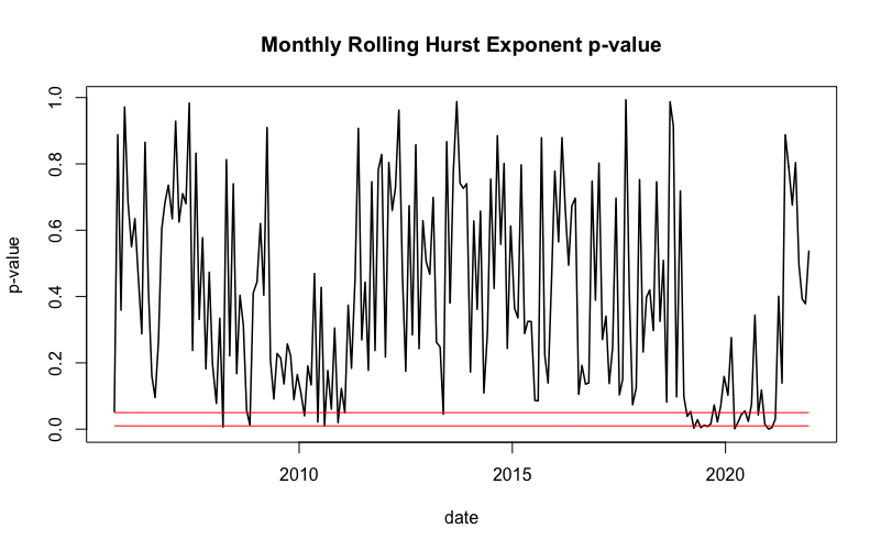
The red lines in this figure represent the 1% and 5% significance levels. So, only the periods below the red line are statistically significant at level threshold alpha (1% / 5%).
Empirical trading edge
As the next step, we conduct the empirical analysis, examining the distributions of returns of SPY right aftercertain significant days. Firstly, we decide which days we consider significant. We chose to analyze returns after the day with the highest daily return, the lowest daily return, the day with the highest 21-day volatility, and the day with the lowest 21-day volatility.
In other words, we firstly looked at how the market has historically behaved after huge returns in both directions (positive/negative). Secondly, we analyzed the market behavior after both volatility extremes (low/high).
Methodology
Each day we look at whether that day’s return is one of the top 25 most significant days from the past year (250 days). If yes, then we examine the 1-day, 2-day, and 3-day return after this significant day (cumulative for all such occasions). Lastly, we plot the results and display them as an empirical probability density function. We compare this distribution to the distribution of SPY’s 1-day, 2-day, and 3-day returns from July 2002 till January 2022 (whole sample).
Let’s take the lowest return decile as an example. Our “significant day” is the day that belongs to the lowest return decile of the past year. Each day in our sample we look at whether this day belongs to the bottom 25 returns of the past 250 days. If yes, we then note down the return the they after. We move 1-day ahead and repeat the analysis. This way we avoid any lookahead biases and keep the analysis as closest to “out-of-sample” as possible.
The day with the lowest return
The first significant day we analyze is the day with the lowest return. More specifically, we look at the lowest return decile of the past year and we analyze the 1-day, 2-day, and 3-day performance after all days belonging to this lowest decile. Below we display the density function of the 1-day returns after the days with the lowest returns.
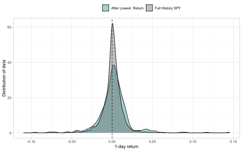
First of all, the density of the returns after the day with the lowest return is much less concentrated around zero (lower kurtosis) than the density function of the benchmark SPY returns. This implies that the volatility of returns after very low returns is higher than the average. This is to be expected, given that extremely negative returns usually occur in a high-volatility environment.
Secondly, the distribution of returns after lowest returns has heavier tails, indicating more outliers and extreme movements. Thirdly, we can observe that the center of the density is slightly skewed to the right, indicating a positive trading edge. Fourthly, a “tail” around +5% mark is clearly bigger for these days, once again indicating a positive trading edge. Lastly, we calculated that 57.7% of 1-day returns are positive after a day with the lowest return
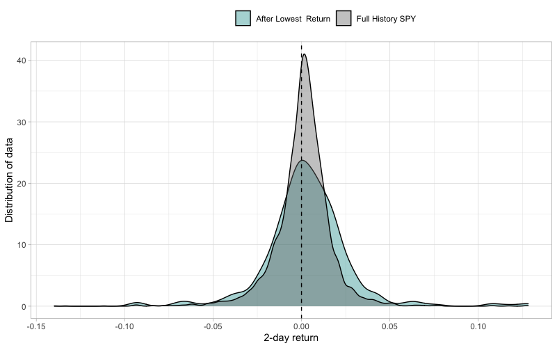
Similar to the first figure, the second figure portrays the distribution of 2-day returns after the lowest return decile, compared to 2-day SPY returns. Similar to 1-day returns, it is slightly skewed to the right, indicating a positive trading edge. Furthermore, a slightly positive skewness implies more positive 2-day returns than negative. To be precise, 58.1% of 2-day returns are positive after a day in the lowest return decile. Also, the distribution’s right tail is heavier than the full History SPY, which implies some degree of positive trading edge.
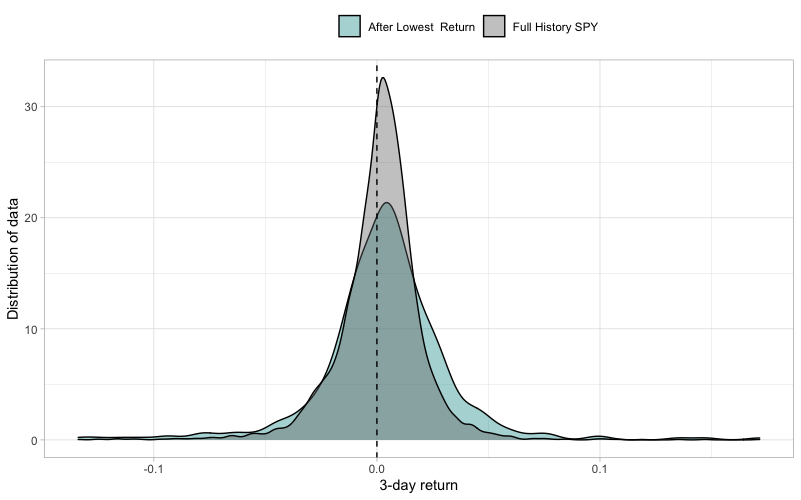
Lastly, we plotted the density of 3-day returns after the day with the lowest return. The probability of a positive 3-day return after a day with the lowest daily return is 59.7%. This distribution has the heaviest tails of all three distributions mentioned above. Also, it is most visibly skewed to the right.
The day with the highest return
Secondly, we analyzed the performance of SPY after the highest daily return decile of the past year. Specifically, we look at the 1-day, 2-day, and 3-day performance after these days. So, for example, the following figure shows 1-day returns right after the days with the highest return.
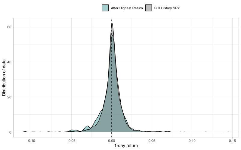
The figure shows, that the density of the 1-day returns after the day with the highest return is almost as concentrated around 0.00% return as the density function of the 1-day returns of full-history SPY. In other words, they have a similar kurtosis. Secondly, the density curve is not as skewed to the right as the density curve of the returns after the days with the lowest daily return.
Thirdly, after the highest daily return, only 52.9% of the 1-day returns are positive, 57.0% of the 2-day returns are positive, and 60.2% of the 3-day returns are positive. Additionally, this distribution’s left tail is heavier compared to that of the lowest daily return, which indicates a possible trading edge for the short positions.
The day with the lowest 21-day volatility
In our third empirical trading edge analysis, we examined 1-day, 2-day, and 3-day returns after the day with the lowest 21-day volatility. The following figure illustrates the distribution of 1-day performance after the lowest volatility decile days.
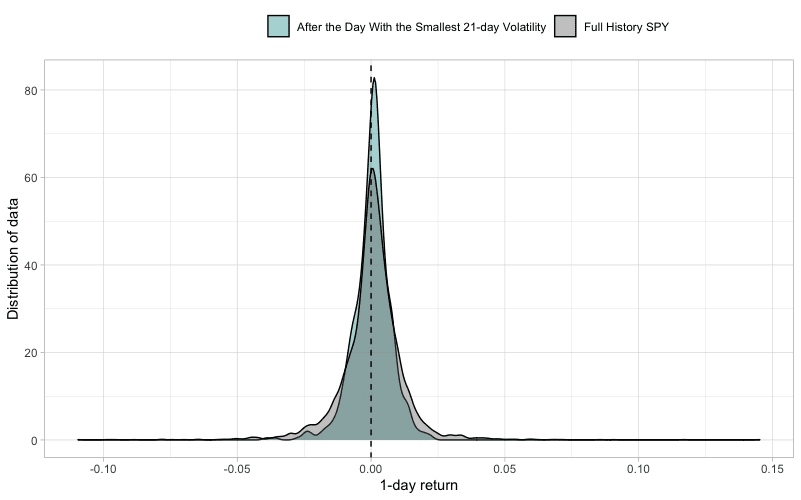
It is clear from the figure above that the density of the 1-day returns after the day with the smallest 21-day volatility is much more concentrated around zero than the density of the benchmark (SPY). In other words, kurtosis is higher. This implies a very low volatility even on the next day, which is a so-called phenomenon of volatility clustering. The clustering around 0.00% return is also visible on the tails, which are very light.
Further, 57.7% of the 1-day returns, 58.1% of the 2-day returns, and 59.7% of 3-day returns are above zero. To sum up, we cannot be sure whether returns after least volatile days will be positive, but we can be pretty much confident they will not be volatile. Thus, we have to examine this long/short trading edge further, which we do in the next section.
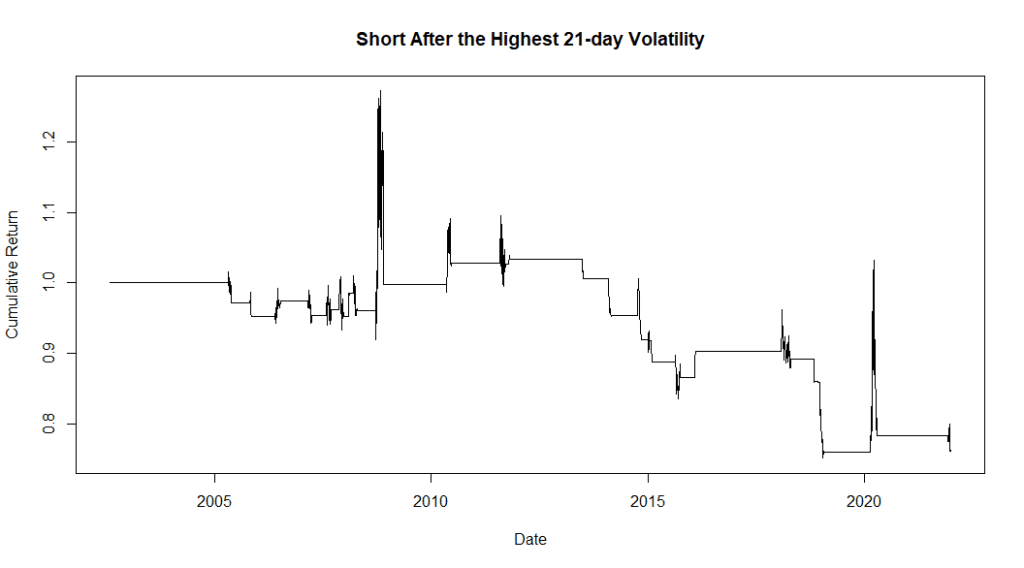
The day with the highest 21-day volatility
Lastly, we observed 1-day, 2-day, and 3-day returns after the days in the highest 21-day volatility decile. The following figure illustrates the distribution of 1-day returns after these days with the highest volatility.
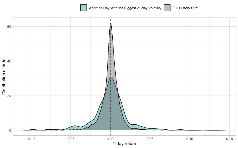
Contrary to the previous figure, the highest point of the density function of 1-day returns after the highly volatile day is very low. The tails are much heavier and the kurtosis is much lower for days after high-volatility days. This again points to heavy volatility clustering, which seems to be even more pronounced when it comes to high volatility.
There’s no clear trading edge to either long or short side, but there’s definitely an edge towards a following highly volatile day. Last but not least, only 53.6% of the 1-day returns, 55.3% of the 2-day returns, and 55.0% of 3-day returns are above zero – the worst ratios so far.
Practical trading edge – Short-Term Strategies
The last, and the most important section of this article analyzes simple short-term trading strategies. These strategies represent the actual trading edges we suspect may exist when applied to various assets.
Some of these short-term trading strategies are based on the statistical properties of an asset (section 1). Some of them are based on our empirical trading edge analysis (section 2). In this section, we also add several new trading-edge ideas, we haven’t mentioned yet. We present the equity curves of such strategies in addition to the tables of risk and return characteristics.
Trading Based on Significant Days
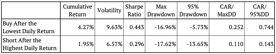
The first strategy we tested has very simple trading rules: each day, look if the daily return belongs to the 25 lowest (/highest) returns of the past year (250 days). If it does, go long (/short) the next day. This “trading edge” idea is based on our already performed empirical analysis from the last section.
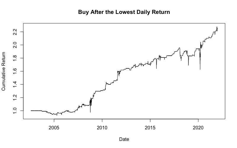

The strategy that goes long after the days with the lowest returns definitely has a positive trading edge. It also has a pretty nice and stable equity curve. You can easily find out in our upcoming Quantpedia Pro report how this strategy looks like when applied to any asset of your choice. Stay tuned!
On the other hand, the short variant of the strategy seems to be working only during bear markets and the positive edge is not so straightforward. The following table presents the risk and return characteristics of the two strategies.
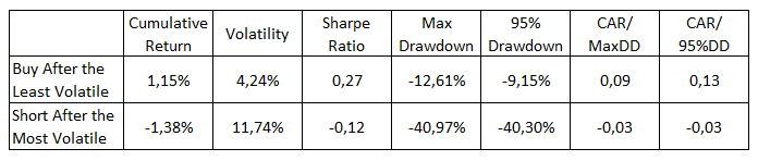
Secondly, we analyzed another strategy with similar trading rules, this time related to volatility. Each day, determine if the short-term volatility (21-days) is in its lowest (highest) decile. If it is, go long (/short) on the next day. The following figures show the cumulative performance of both strategies.

As we can see, the strategy that goes long after the least volatile days provides a significant positive trading edge. That being said, the Low volatility anomaly maybe works not only on stocks but also on an index level.
On the other hand, the “high volatility” anomaly doesn’t seem to be working in either direction. The following table shows both of these strategies’ risk and return characteristics.
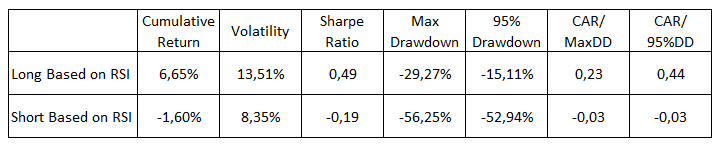
Relative Strength Index
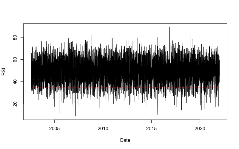
The following strategies utilize the well-known Relative Strength Index (RSI). The RSI is a momentum indicator that identifies when a stock is overbought or oversold. The index oscillates between zero and 100. Usually, an asset is considered overbought when RSI > 70. On the other hand, an asset is considered oversold when RSI < 30.
We analyzed two approaches to RSI – long and short. First, we set the upper limit to 65 and the lower limit to 35. Then, we also created a “middle boundary” and set its value to 55. The following figure illustrates the value of RSI for SPY, the lower/upper limit (red lines), and the middle boundary (blue line).
The first strategy buys when the value of RSI falls below the lower limit and holds until the RSI rises above the middle boundary. The following figure illustrates the cumulative return of this strategy.

There’s definitely a positive trading edge in buying oversold market conditions. The final equity curve of the long-only RSI strategy is one of the best and most stable we’ve analyzed in this article so far.
The second strategy shorts when the value of RSI rises above the upper limit and holds until the RSI falls below the middle boundary. The following figure illustrates the cumulative return of this strategy.
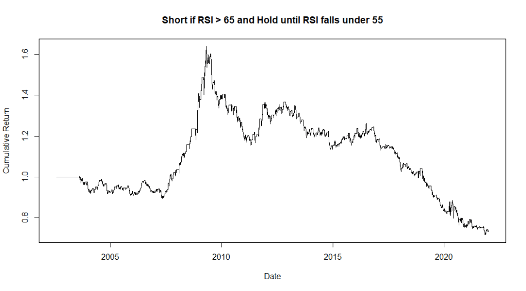
Lastly, we present the table of risk and return characteristics of these strategies.
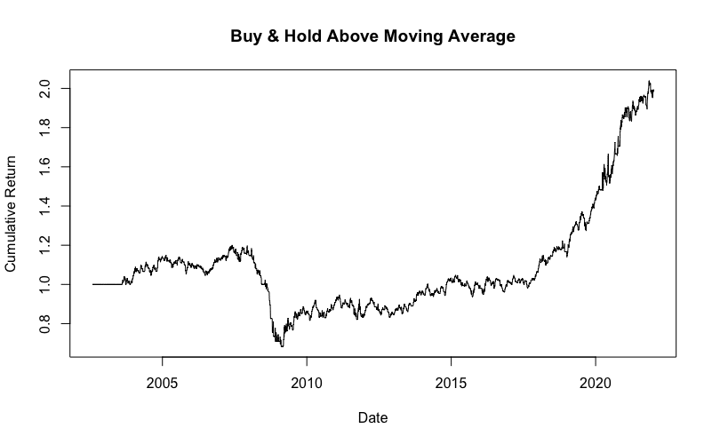
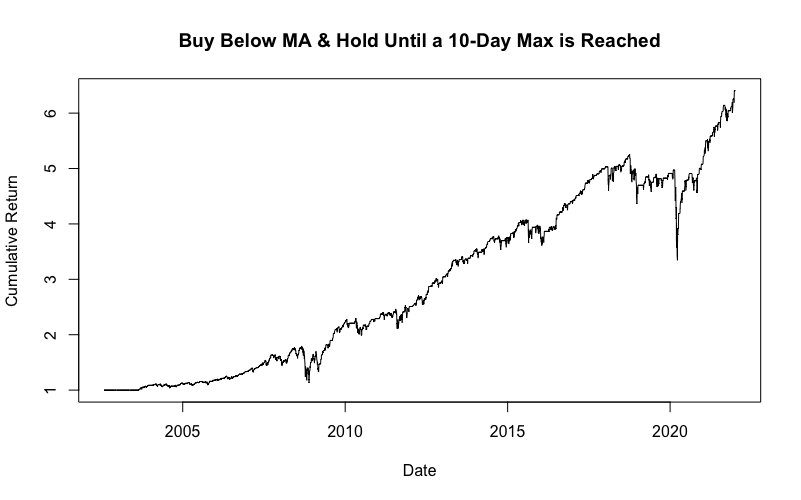
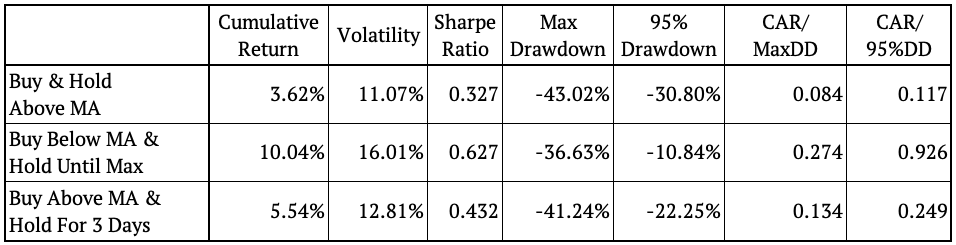
Moving Average Based Strategies
This section explores three strategies that trade based on moving averages. The first strategy has straightforward rules: buy when the price rises above the 10-day moving average and hold until it falls below the MA. The figure below shows the cumulative return of such a strategy.
The second strategy buys when the price falls below the 10-day moving average and holds until it reaches a 10-day maximum. Again, the figure below illustrates the cumulative return of such a strategy.
Lastly, we analyzed a strategy that buys when the price rises above the 10-day moving average and holds for 3 days. The figure below shows the cumulative return of such a strategy.
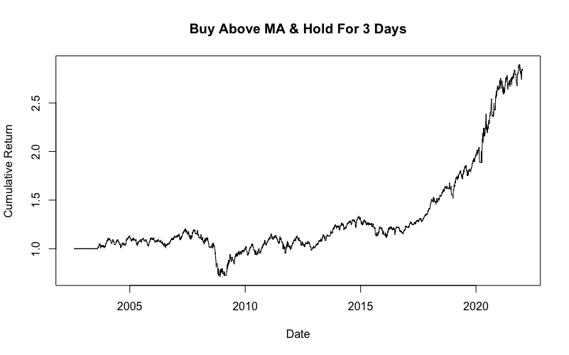
The following table shows the risk and return characteristics of these strategies.
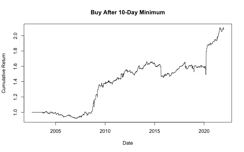
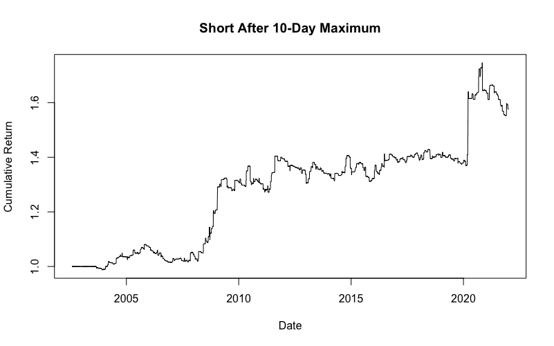
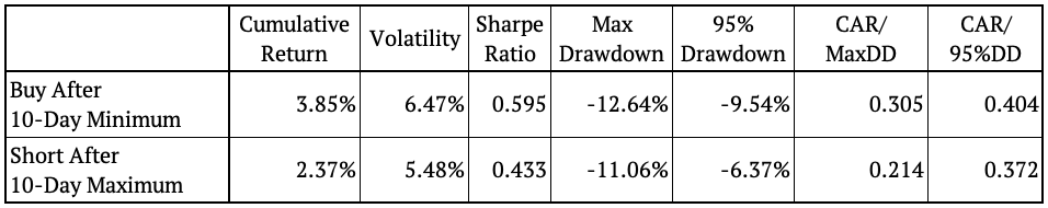
10-Day Minimum / Maximum
The last two strategies make trades based on the 10-day minimum/ maximum of an asset. The rules are again elementary. Find out if today’s price is at its 10-day minimum (/maximum), and if it is, go long (/short). The following figures illustrate the equity curves of these strategies.
Lastly, the following table shows the risk and return characteristics of these strategies.
Conclusion
This post focuses on numerous statistical, empirical and other trading properties of the assets we all trade. We looked at several trading edge ideas and examined whether they work or not when applied to our chosen asset.
We started with the theoretical background – statistical methods. Namely, we analyzed the Hurst Exponent. We applied the exponent to find statistically significant trend or mean-reversion periods.
Secondly, we conducted various empirical trend/ mean-reversion/ volatility analyses. We presented the results in form of return distributions, displayed as return density functions. Although this analysis produced promising results, it was not enough to evaluate whether these edges actually lead to profitable investment strategies or not. Therefore, in the last section, we create multiple simple trading strategies, so-called short-term trading edges.
The strategies implement simple trading rules, such as buy (/short) after a significant day or buy (/short) based on moving average rules. We also presented a strategy that utilizes the Relative Strength Index (RSI). Last but not least we tested a trading strategy that searches for the days with the highest (/lowest) price and trades just around these days.
One final note – all of the trading ideas presented in this article are not meant to be final investment strategies. The aim of our trading edge ideas is to inspire you and give you a place to start when building a more complex strategy of your choice. Happy trading!
Author:
Daniela Hanicova, Quant Analyst, Quantpedia
Are you looking for more strategies to read about? Sign up for our newsletter or visit our Blog or Screener.
Do you want to learn more about Quantpedia Premium service? Check how Quantpedia works, our mission and Premium pricing offer.
Do you want to learn more about Quantpedia Pro service? Check its description, watch videos, review reporting capabilities and visit our pricing offer.
Do you want algorithmic access to the full Quantpedia database via the API? Subscribe to Quantpedia Pro, ask for an API key, and explore the in/out-of-sample statistics, source academic papers, and code snippets — ideal for quantitative research, systematic trading workflows, and AI model training.
Are you looking for historical data or backtesting platforms? Check our list of Algo Trading Discounts.
Or follow us on:
Facebook Group, Facebook Page, Telegram, Twitter, Linkedin, Medium or Youtube
Share onLinkedInTwitterFacebookRefer to a friend