Modelling the Bottom of the Covid-19 Financial Crisis
The global pandemic of current scope is something that was experienced by only a few of the currently living people. We have some historical accounts of how it unfolded in the past, but otherwise, it is uncharted territory. It is a true Black Swan event – event that I believe was in nobody’s lineup of stress testing scenarios. But we can still try to get some understanding of the scope of the current situation.
The actual global crisis is a mix of 2 crisis. The first one is the health-care / pandemic crisis, during which millions of people will be infected, and unfortunately, a lot them will die. The second crisis is the economic crisis/recession, which will follow simultaneously with (or soon after) the first one (due to the decrease in worldwide supply and demand).
The second crisis cannot end before the first one is solved. It is impossible to predict how the world will look like in three months, which health care measures and economic stimulus will be adopted. But we can say that the current situation will get worse before it is better. We cannot exactly say when the market bottom will occur, but at least we can try to model the minimum time needed for things to get under control during the pandemic. And we can say that the economic situation will probably not get better before pandemic will be under control.
We tried to find daily (or weekly) estimate of sick people during the Spanish Flu episode but didn’t find the good source for it. If any of you readers know about the data series which can be used, please let the quant community know. It can be a very useful source for a lot of us.
We do not have good historical data from the last pandemic of the same proportion, but we can try to check how financial markets behaved during the first phase of the current pandemic – the “Wuhan phase”. We are using data from the web https://www.worldometers.info/coronavirus/ and WHO Situation Reports, we recommend them to everyone interested in this subject.
The following chart shows daily new cases of coronavirus as reported to WHO (chart is from https://www.worldometers.info/coronavirus/ ).
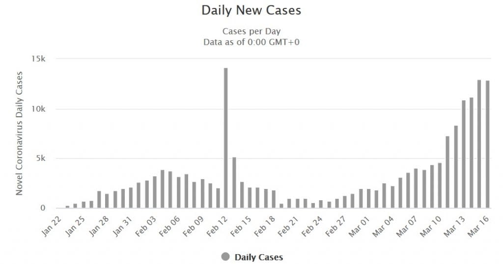
We can now analyse the behaviour of URTH ETF (which uses MSCI World Index as underlying and which we can use as a proxy for world equities) to see how world equities reacted to peak in reported cases in Asia.
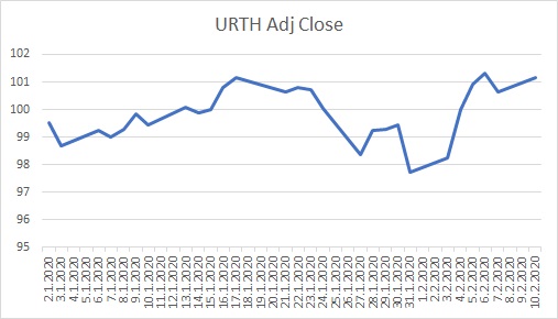
The first phase of coronavirus pandemic peaked on 4th of February when 3915 cases were reported. URTH ETF bottomed on 31st of January (Friday), then jumped a little on the 3rd of February (Monday) and then jumped a lot on 4th of February. World equity markets predicted that cases would peak; the difference between the actual market bottom and peak in coronavirus cases was just a few days. It is not a stretch of logic to anticipate similar behaviour in the future.
Now, don’t get us wrong. We are not saying that market will hit bottom when coronavirus cases will peak. There will surely be significant economic implications from the current pandemic outbreak and those problems can (and probably will) cause additional pressure on market prices. The only thing which we are saying is the following – the market will probably NOT bottom out before the coronavirus pandemic is turned around.
Now, this seems like very vague information. But sometimes it helps to know when something will not happen because we can act accordingly. For example, we can stop holding risky assets, or we can employ hedging strategies suitable for the bear market during the time of crisis. Especially if that crisis is expected to unfold for a longer time.
And there is one more advantage. Modelling the behaviour of financial markets is extremely hard because financial markets are really noisy, with a lot of feedback loops. Modelling pandemic behaviour is hard too, but maybe it is easier than modelling the behaviour of financial markets.
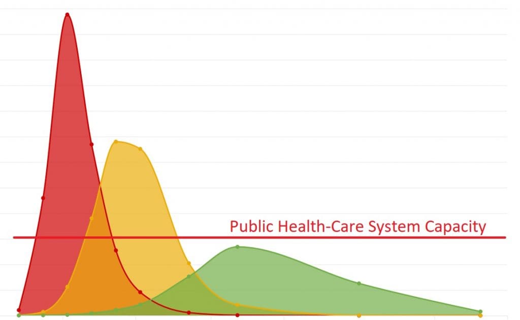
There is a lot of theory related to modelling a pandemic but let’s try to simplify the message. We can approach this pandemic in three ways – we can do just a few interferences into a pandemic, and it can be over quickly (red curve) but with a high cost of lives (as during the peak of the pandemic, number of infected people will greatly exceed the capacity of our health care system). We can do a lot of mitigation tasks to help our public health care system (green curve), but pandemic will unfold for a long time (but a lot of lives will be spared). Or we can pick a middle ground. It seems that each country in the world is going in a different direction. There is not one prefered model. Maybe, the world on average will be somewhere along the yellow curve. And now the most important question in everybody’s mind. How long will it take?
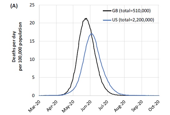
Let us turn to a study written by WHO Collaborating Centre for Infectious Disease Modelling: Impact of non-pharmaceutical interventions (NPIs) to reduce COVID-19 mortality and healthcare demand. Study is written by multiple authors and they say: “Here we present the results of epidemiological modelling which has informed policymaking in the UK and other countries in recent weeks. In the absence of a COVID-19 vaccine, we assess the potential role of a number of public health measures – so-called non-pharmaceutical interventions (NPIs) – aimed at reducing contact rates in the population and thereby reducing transmission of the virus. In the results presented here, we apply a previously published microsimulation model to two countries: the UK (Great Britain specifically) and the US.“
What are the results?
“In the (unlikely) absence of any control measures or spontaneous changes in individual behaviour, we would expect a peak in mortality (daily deaths) to occur after approximately 3 months (Figure 1A). In such scenarios, given an estimated R0 of 2.4, we predict 81% of the GB and US populations would be infected over the course of the epidemic. Epidemic timings are approximate given the limitations of surveillance data in both countries: The epidemic is predicted to be broader in the US than in GB and to peak slightly later. This is due to the larger geographic scale of the US, resulting in more distinct localised epidemics across states (Figure 1B) than seen across GB. The higher peak in mortality in GB is due to the smaller size of the country and its older population compared with the US. In total, in an unmitigated epidemic, we would predict approximately 510,000 deaths in GB and 2.2 million in the US, not accounting for the potential negative effects of health systems being overwhelmed on mortality.“
The next picture from this thesis shows the number of occupied critical beds over time for the UK. We do not have a picture of the number of cases, but it will probably be ahead by only a week or two.
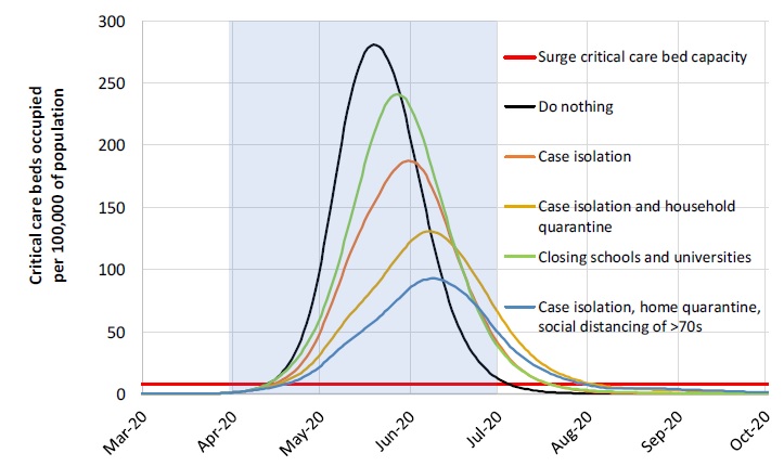
We can see that the soonest we can expect the peak of this pandemic in the UK is in the middle of May, but it can slip into the middle of June. US is behind the UK maybe by two weeks.
We can’t expect this bear market to bottom sooner, only later.
There are a few more disturbing facts in that study, but I will not mention them at this moment in this short article (like a seasonal re-occurrence, etc.).
Be careful and stay safe …
Radovan Vojtko
CEO & Head of Research, Quantpedia
PS: Would you like to model your own scenarios?
Multiple pandemic models can be used to estimate the behaviour of the current covid-19 pandemic as there are multiple tools that you can use. We are currently playing with the following tool from Neherhab: https://neherlab.org/covid19/. It is not the only one; there are more similar tools popping on the internet at the moment.
Are you looking for strategies applicable in bear markets? Check Quantpedia’s Bear Market Strategies
Are you looking for more strategies to read about? Sign up for our newsletter or visit our Blog or Screener.
Do you want to learn more about Quantpedia Premium service? Check how Quantpedia works, our mission and Premium pricing offer.
Do you want to learn more about Quantpedia Pro service? Check its description, watch videos, review reporting capabilities and visit our pricing offer.
Do you want algorithmic access to the full Quantpedia database via the API? Subscribe to Quantpedia Pro, ask for an API key, and explore the in/out-of-sample statistics, source academic papers, and code snippets — ideal for quantitative research, systematic trading workflows, and AI model training.
Are you looking for historical data or backtesting platforms? Check our list of Algo Trading Discounts.
Or follow us on:
Facebook Group, Facebook Page, Telegram, Twitter, Linkedin, Medium or Youtube
Share onLinkedInTwitterFacebookRefer to a friend