Are Alternative Social Data Predictors Useful for Effective Allocation to Country ETFs?
Introduction
The part of the attention of our own research from the last few months was a little skewed on the side of countries’ indices and their corresponding ETFs representing them, and we finally conclude our “trilogy” of investigation on the efficiency of these markets. Firstly, we analyzed price-based valuation measures, and then, in November, we investigated the impact of military expenditures on the performance of international stock markets. We will wrap up this mini-series by analyzing a few additional alternative datasets containing variables we thought might be of interest in meaningfully describing each country’s societal standing – the climate change awareness index, the happiness score, the corruption perception index, and the income inequality score.
How did our pursuit of finding a “free data set gem” and extracting “hidden alpha” from it go? To be honest, we expected a little more. But at least we have disproven some other possibly preconceived notions of their usefulness, as it seems most of the utility is already priced in. From time to time, this needed to be done, so here, we present you with our results.
Motivation and Rationale
The motivation was first place for completely utilizing an already extensive dataset of various performance matrices of ETFs and indices, second place for discovering or proving/refuting some alternative data variables that might predict countries’ societal state and financial performance.
Our hypothesis was: A freely available dataset not of a primary financial nature exists that may direct investment into countries better than hard economic data.
Used Alternative Data and Corresponding Variables
To put our hypothesis to the test, we have had a few “hot” candidates; particularly, we have used some of the “soft” predictors in difference to the “hard” ones, like GDP or CPI, for example. We can also call these predictors “society factors” as they present some kind of “level of life” (or its “distortion”) in the represented country. Here are the sorting variables:
- Does climate change awareness of countries affect the performance of their ETFs?
The Climate Change Performance Index (CCPI) indicates the climate mitigation efforts of 59 countries and the EU, which collectively account for over 90% of global greenhouse gas (GHG) emissions. Results are compiled with 400 national experts evaluating their countries’ most recent national and international climate policies. CCPI increases transparency in national and international climate policy and enables comparison of individual countries’ climate protection efforts and progress. Our exercise aimed to build an “ESG ETF strategy” by using rankings available at CCPI’s direct download page to sort country ETFs based on CCPI, which has been published annually since 2005 and is an independent monitoring tool for tracking countries’ climate protection performance. If you are interested, we welcome you to read more about their construction methodology.
Data source: We have used the Climate Change Performance Index free available data to construct time series of change for needed countries to construct ranks of best to worst. Since there is no consolidated output in the form of a spreadsheet or plain (comma-separated) file, we needed to download a PDF for each year, note the date of release, and scrape the data to the appropriate format needed. There was little pre-processing, and data are mostly consistent (in terms of naming the countries, usage of asterixes, etc.), so it should also be fairly automated.
Dataset and strategy implementation specifics:
- Since CCPI is released in some of the last months of the year, we use ETF data of monthly granularity, contributing to more precise calculations than waiting until end-of-year rebalancing.
- Since Taiwan and Singapore were not ranked in all years, we left/omitted them. We have in total 22-2=20 countries to analyze / invest in based on the strategy presented a bit later on.
- We have the first rankings data from August 2007, so hypothetically, we would have started investing in September 2007 based on these ranks.
2. Will your broad stock market perform better if your inhabitants are happier?
We ranked countries based on selected happiness score measures (there are a few to select from; we selected the most respected one, which has data with the most history). We tried to see if there is any forecasting ability on the long-term performance of various equities in countries represented by their ETFs. The World Happiness Report is a Sustainable Development Solutions Network publication powered by the Gallup World Poll data. The World Happiness Report reflects a worldwide demand for more attention to happiness and well-being as criteria for government policy. It reviews the state of happiness in the world today and shows how the science of happiness explains personal and national variations in happiness.
Data source: there were various. The main one was Kaggle-compiled Happiness Index data, enriched with the official World Happiness Report in case of some countries were missing. The World Happiness Report is written and supported by a group of independent experts acting in their personal capacities. Something worth mentioning from its methodology is that happiness rankings are not based on any index of economic and other well-known factors – the scores are instead based on individuals’ own assessments of their lives. In particular, people answers to the single-item Cantril ladder life-evaluation question, much as epidemiologists estimate the extent to which life expectancy is affected by factors such as smoking, exercise, and diet; where The Cantril ladder asks respondents to think of a ladder, with the best possible life for them being a ten and the worst possible life being a 0. They are then asked to rate their current lives on a 0 to 10 scale.
Note: Our full compiled dataset has data from 2005. Based on end-of-year publication results and immediate sorting, we rebalance portfolios yearly accordingly. Data are complete, and all 22 countries participate.
3. If your country has high corruption, is it reflected in the performance of your stock market?
We used two datasets to try out to compute a more appropriate model.
The better one predicting the possible impacts was the first selected, named Freedom from Corruption Index (0-100) from TheGlobalEconomy.com. Higher index values denote a lower level of corruption. Here comes an unfortunate hiccup: we expected model results to be much better. So, we tried to look for another source.
The second one is the Corruption Perception Index from Land Portal, whose mission is to nurture a growing information ecosystem on land governance to inform and improve decision-making, policy, and practice at all levels. The Corruption Perceptions Index aggregates data from a number of different sources that provide perceptions of business people and country experts of the level of corruption in the public sector. This indicator uses the yearly CPI scores to rank countries based on the level of perceived corruption (the country with the lowest level of perceived corruption is ranked number one). Unfortunately, we have not found this predictor to be better than previous corruption metrics.
4. Does income equality or inequality predict the performance of our broad stock market indices?
From the official description: “The Gini index measures the extent to which the distribution of income or consumption among individuals or households within an economy deviates from a perfectly equal distribution. A Gini index of 0 represents perfect equality, while an index of 100 implies perfect inequality.”
We have had some expectations for this kind of dataset. Our theory was that companies in countries with high income inequality could have higher bargaining power when hiring employees and lower labor costs, and therefore, there could be a significant spread in countries’ performance. Unfortunately, the data are so incomplete that we were not able to test our hypothesis.
We first tried to use a data set from TheGlobalEconomy.com (https://www.theglobaleconomy.com/rankings/gini_inequality_index/), but the data were drastically incomplete. So we immediately headed to the primary source of The World Bank (you can find them in a more general format https://data.worldbank.org/indicator/SI.POV.GINI, or you can go straight to data bank https://databank.worldbank.org/source/world-development-indicators/Series/SI.POV.GINI) but a quick look at quality of data from most recent years disappointed us again.
Investing Strategy Methodology
The investment universe consists (traditionally) of 22 countries represented by their most liquid U.S. ETFs (indices calculations in any case of more historical data).
List of used countries is same as in our Military Expenditures and Performance of the Stock Markets:
| ticker | full name |
| SPY | SPDR S&P 500 ETF Trust |
| EWU | iShares MSCI United Kingdom ETF |
| EWG | iShares MSCI Germany ETF |
| EWQ | iShares MSCI France ETF |
| EWI | iShares MSCI Italy ETF |
| EWD | iShares MSCI Sweden ETF |
| EWN | iShares MSCI Netherlands ETF |
| EWP | iShares MSCI Spain ETF |
| EWK | iShares MSCI Belgium ETF |
| EWL | iShares MSCI Switzerland ETF |
| EWC | iShares MSCI Canada ETF |
| EWJ | iShares MSCI Japan ETF |
| EWW | iShares MSCI Mexico ETF |
| EWM | iShares MSCI Malaysia ETF |
| EWA | iShares MSCI-Australia ETF |
| EWS | iShares MSCI Singapore ETF |
| EWY | iShares MSCI South Korea ETF |
| EWT | iShares MSCI Taiwan ETF |
| EWZ | iShares MSCI Brazil ETF |
| EZA | iShares MSCI South Africa ETF |
| FXI | iShares China Large-Cap ETF |
| INDY | iShares India 50 ETF |
This is the calculation procedure and trading execution:
- Collect and post-process individual predictors
- Rank countries based on those predictors (on monthly or yearly basis)
- Create a long-short model based on rank
- going long x best ranked countries and
- going short x worst ranked countries.
- Hold positions until new data; recalculate, and rebalance (monthly or yearly).
Countries in the list are weighted equally and rebalanced whenever new data comes in.
Recently, Yahoo Finance discontinued free end-of-day data downloads. As a result, we recommend sourcing data from our preferred provider, EODHD.com – the sponsor of our blog. EODHD offers seamless access to +30 years of historical prices and fundamental data for stocks, ETFs, forex, and cryptocurrencies across 60+ exchanges, available via API or no-code add-ons for Excel and Google Sheets. As a special offer, our blog readers can enjoy an exclusive 30% discount on premium EODHD plans.
Results
Unfortunately, most of the tested strategies based on all mentioned alternative datasets provided very weak drift in all diversified portfolios.
1.
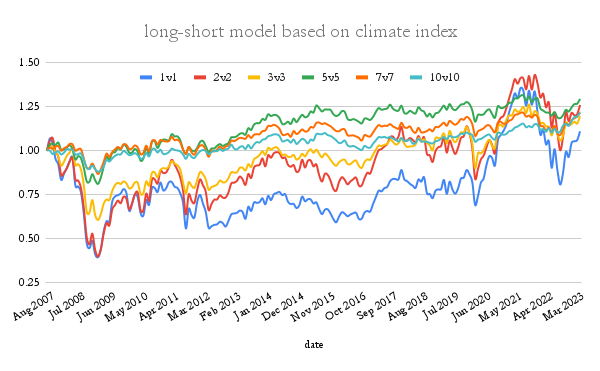
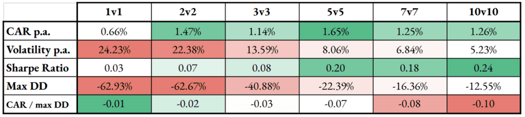
Our first tested alternative score was based on the climate change performance index. The concentrated portfolio holding 1v1, 2v2 or 3v3 ETFs had a very small Sharpe Ratio. However, more diversified 5v5, 7v7, or 10v10 models provided better Sharpe ratios. The total spread return is very small, and the country ETFs market is quite efficient. It’s not a model for a new ETF ESG factor, but at least the return spread is positive.
2.
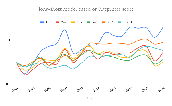
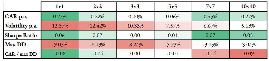
The second tested model was built on the happiness score. The signal is almost non-recognisable and may be as well mistaken for randomness. Looks like the happiness of countries’ citizens does not predict international stock markets performance.
3.
We went to try out long (buy) “less-corrupt”, and (sell) short “more-corrupt” countries on a yearly basis.
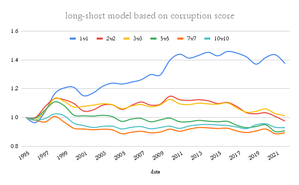
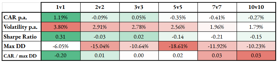
Here, buying the least corrupt country and shorting the most corrupt ones from 22 countries is best (we are using Freedom from Corruption Index (0-100)). However, the other alternatives, regarding the number of countries involved, do not retain the performance spread and provide non-convincing results.
The results from the Corruption Perceptions Index gave all negative alphas; therefore, we do not include them here.
4.
We did not try to construct a strategy using the Gini Index since the data were missing for most countries, and it was impossible to create a more-or-less complete model.
Conclusion
Unfortunately, our quest to find a really good model using an alternative “society factor” has failed. Pricing of country ETFs (and, on top of that, indices) is pretty damn accurate, and there are little to no alternative data that provide an edge large enough to exploit it more essentially. The climate change awareness index seems the most useful dataset, but even that doesn’t offer a very significant performance spread in the long-short ETF portfolio.
As for why, we propose a partial explanation: Our investment universe consists of developed and emerging markets mixed together. It is possible that the impact of these societal factors is much more prevalent in emerging countries only, and our inclusion of developed markets into the investment universe is detrimental. Why do we think so? A successful example of index methodology that employs “non-economic data” to construct an alternatively weighted index for emerging markets exists – Freedom 100 Emerging Markets ETF. The FRDM ETF has outperformed its peer emerging markets ETFs so far. It may be the case that emerging markets are less efficient, and “societal factors” may offer significant performance spread there. It is, at the moment, only a hypothesis, but we plan to look deeper into it in the future…
Are you looking for more strategies to read about? Sign up for our newsletter or visit our Blog or Screener.
Do you want to learn more about Quantpedia Premium service? Check how Quantpedia works, our mission and Premium pricing offer.
Do you want to learn more about Quantpedia Pro service? Check its description, watch videos, review reporting capabilities and visit our pricing offer.
Do you want algorithmic access to the full Quantpedia database via the API? Subscribe to Quantpedia Pro, ask for an API key, and explore the in/out-of-sample statistics, source academic papers, and code snippets — ideal for quantitative research, systematic trading workflows, and AI model training.
Are you looking for historical data or backtesting platforms? Check our list of Algo Trading Discounts.
Or follow us on:
Facebook Group, Facebook Page, Twitter, Linkedin, Medium or Youtube
Share onLinkedInTwitterFacebookRefer to a friend