Why Average Strategy Performance Can Mislead Portfolio Research
Average strategy performance is one of the most common shortcuts in portfolio research. It gives the researcher a clean benchmark, a single reference line, and a simple way to compare one strategy against a broader group of similar strategies. In many cases, this is useful. But it can also be misleading.
The problem is that an average hides dispersion. Two peer groups can have the same average return, but the internal structure of those groups can be completely different. In one year, nearly all strategies may behave similarly and cluster around the median. In another year, the same average may hide a wide spread between winners and losers. For portfolio construction, this distinction matters.
This case study shows how Quantpedia API can be used to go beyond the average peer group return and measure yearly performance dispersion across a group of trend-following strategies. The goal is not only to ask how the average strategy performed, but also how different the individual strategies were from each other.
From an Average Benchmark to a Peer Group Distribution
A standard peer group benchmark usually starts with a simple idea. We select a group of comparable strategies, calculate their historical performance, and use the average as a reference point. This tells us whether a strategy is above or below the peer group average.
However, this does not answer a more important research question. Was the peer group tightly clustered, or was it widely dispersed?
If the peer group dispersion is narrow, the average is a reasonably representative benchmark. If the dispersion is wide, the average becomes much less informative. A strategy can underperform the average but still be within the normal range of peer group outcomes. Alternatively, it can match the average while hiding significant exposure to a very different risk profile.
Using Quantpedia API, we can analyze this directly. The script automatically selects a peer group of trend-following strategies from the Quantpedia database, using filters based on strategy name, instrument type, and available performance data. In this example, the selected universe consists of strategies using Futures, ETFs, or Funds.
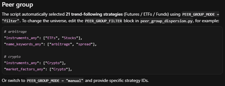
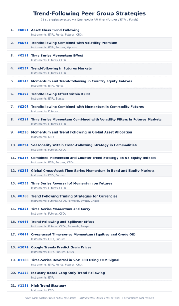
The final peer group contains 21 trend-following strategies. This is a useful sample because the strategies are thematically related, but they are not identical. They differ in traded instruments, asset classes, implementation logic, and portfolio construction. That is exactly what makes dispersion analysis interesting.
Research Workflow
The workflow is built around daily performance data downloaded through Quantpedia API. For each selected strategy, the script retrieves the available performance history, aligns the data by date, and calculates calendar-year returns from 2015 to 2026. The 2026 value is treated as year-to-date performance through 30 June 2026.
The annual return calculation is done from daily returns by compounding within each calendar year. This is important because the analysis does not use annualized estimates. It uses actual realized performance for each year in the sample, with 2026 handled as a partial year.
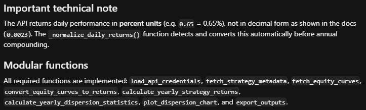
There is also one technical detail that matters for reproducibility. The API output used in this workflow returns daily performance in percent units, for example 0.65 means 0.65 percent. The script detects and normalizes this format before compounding the daily returns. This avoids mixing percent notation with decimal return notation.
After yearly returns are calculated for every strategy, the script summarizes each year cross-sectionally. For every year, it calculates the median, average, 25th percentile, 75th percentile, interquartile range, minimum, maximum, and the number of strategies with valid data.
The interquartile range is the key statistic in this case study. It measures the distance between the 25th and 75th percentile, which means it shows the spread of the middle half of the peer group. In practical terms, it tells us whether the core group of strategies behaved similarly or whether their results were meaningfully different.
The Dispersion Chart
The main output is a yearly peer group dispersion chart. The x-axis shows the years from 2015 to 2026 YTD. The y-axis shows annual performance in percent. The blue shaded area shows the 25th to 75th percentile band. The solid line shows the median strategy, while the dashed line shows the average. The wider vertical ranges show the broader spread between the weaker and stronger strategies.
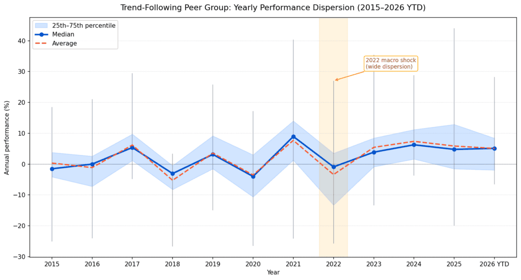
This chart makes the main point immediately visible. Some years show relatively narrow dispersion, meaning that most strategies in the peer group behaved in a similar way. In those years, the average is a reasonable summary of the group. Other years show much wider dispersion, meaning that the average becomes only a partial and potentially misleading description.
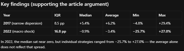
The highlighted year 2022 is the clearest example. The median strategy was close to zero, and the average was negative. But this does not fully describe what happened inside the peer group. Individual strategies ranged from approximately minus 25.7 percent to plus 27.0 percent. That is a much wider story than the average alone would suggest.
Why 2022 Is a Useful Case Study
The year 2022 was a major macro shock year. Inflation pressure, rising interest rates, energy market stress, sharp moves in bonds, and the beginning of the war in Ukraine created a difficult environment for many portfolios. At the same time, these conditions created strong trends in several asset classes.
For trend-following strategies, this kind of environment can produce very different results. A diversified strategy with exposure to commodities, currencies, bonds, and equity indices may behave very differently from a narrower strategy focused mainly on equities or a smaller instrument universe. Some strategies may benefit from persistent moves in commodities or rates. Others may lag because of their universe selection, signal design, volatility targeting, rebalancing rules, or risk management.
This is exactly where peer group dispersion analysis becomes useful. It shows when individual strategy construction matters more than the average category label. In calm years, the difference between strategies may be smaller. In macro shock years, the same broad strategy family can contain both strong winners and meaningful losers.
For a portfolio researcher, this changes the interpretation of performance. A weak result in a wide-dispersion year does not necessarily mean that the strategy is structurally broken. It may mean that the strategy was positioned in the weaker part of the peer group distribution. Similarly, a strong result may not only reflect better timing, but also a more suitable asset class mix or portfolio construction for that specific macro regime.
Practical Value for Portfolio Construction
The practical lesson is that peer group research should not stop at the average. The spread around the average is part of the research signal.
If dispersion is narrow, the average benchmark is informative. It suggests that most comparable strategies behaved similarly, so the average gives a fair approximation of the opportunity set. If dispersion is wide, the researcher needs to look deeper. The key question is no longer only whether a strategy beat the average, but why some strategies performed better than others.
This can support several portfolio research tasks. It helps with peer group benchmarking, strategy due diligence, macro event analysis, and diversification checks. It can also help identify whether a strategy’s underperformance is unusual or whether it falls within the normal range of peer group outcomes.
In portfolio construction, this is especially important because diversification is not only about holding more strategies. It is about understanding when those strategies are likely to behave differently. Dispersion analysis gives a practical way to observe this year by year.
Reproducible Output Structure
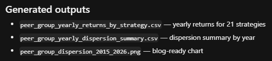
The project produces a complete set of outputs for further research and article documentation. The first file contains yearly returns for each strategy. The second file contains the yearly dispersion summary. The third file is the blog-ready dispersion chart.
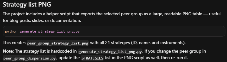
The workflow also includes a separate strategy list PNG, which documents the selected peer group in a readable format. This is useful for blog posts, internal research documentation, or follow-up analysis, because it makes the input universe visible without requiring the reader to inspect the code.
The final project folder contains the Python scripts, environment template, generated CSV files, dispersion chart, and strategy list image. This makes the workflow reproducible and easy to modify. If the researcher wants to test a different peer group, such as arbitrage strategies, value stock-picking strategies, growth stock-picking strategies, or crypto strategies, the same workflow can be reused by changing the filter or providing a manual list of strategy IDs.
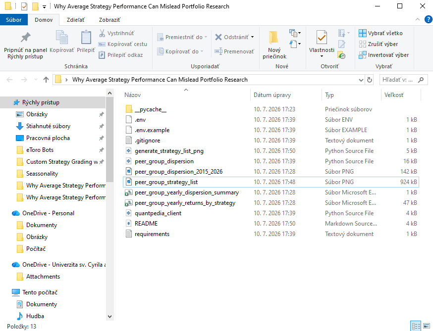
This reproducibility is an important part of the Quantpedia API workflow. The API provides the underlying strategy data, the script transforms it into yearly peer group statistics, and the final outputs can be used directly in research reports, blog articles, or portfolio diagnostics.
Conclusion
Average strategy performance is useful, but it is incomplete. It compresses a full peer group into one number and can hide the most important information: how different the individual strategies were from each other.
Quantpedia API makes it possible to analyze this directly. By downloading daily performance histories for a full peer group of strategies, researchers can calculate yearly returns, compare average and median performance, measure the 25th to 75th percentile range, and identify years when dispersion widened.
The main takeaway is simple. A peer group benchmark should not be treated only as an average line. The dispersion around that line often contains the more important research insight. In stable years, the average may be representative. In macro shock years, the difference between individual strategies can become a central portfolio construction issue.
That is why peer group dispersion analysis is a useful addition to standard benchmark research. It helps researchers understand not only how the average strategy performed, but also when strategy construction, asset class exposure, and diversification mattered most.
Author: David Mesicek, Junior Quant Analyst, Quantpedia
Are you looking for more strategies to read about? Sign up for our newsletter or visit our Blog or Screener.
Do you want to learn more about Quantpedia Premium service? Check how Quantpedia works, our mission and Premium pricing offer.
Do you want to learn more about Quantpedia Pro service? Check its description, watch videos, review reporting capabilities and visit our pricing offer.
Do you want algorithmic access to the full Quantpedia database via the API? Subscribe to Quantpedia Pro, ask for an API key, and explore the in/out-of-sample statistics, source academic papers, and code snippets — ideal for quantitative research, systematic trading workflows, and AI model training.
Are you looking for historical data or backtesting platforms? Check our list of Algo Trading Discounts.
Or follow us on:
Facebook Group, Facebook Page, Telegram, Twitter, Linkedin, Medium or Youtube
Share onLinkedInTwitterFacebookRefer to a friend